![]()
back
ANTONIO PETRUCCELLI
PUBLISHED FORTUNE COVERS
The original sketches were done in gouache with few exceptions. Colour separations in black and white. Unless otherwise indicated all were printed in letter press/gravure. The paper stock was specially made for FORTUNE – of very tough quality. |
|
|
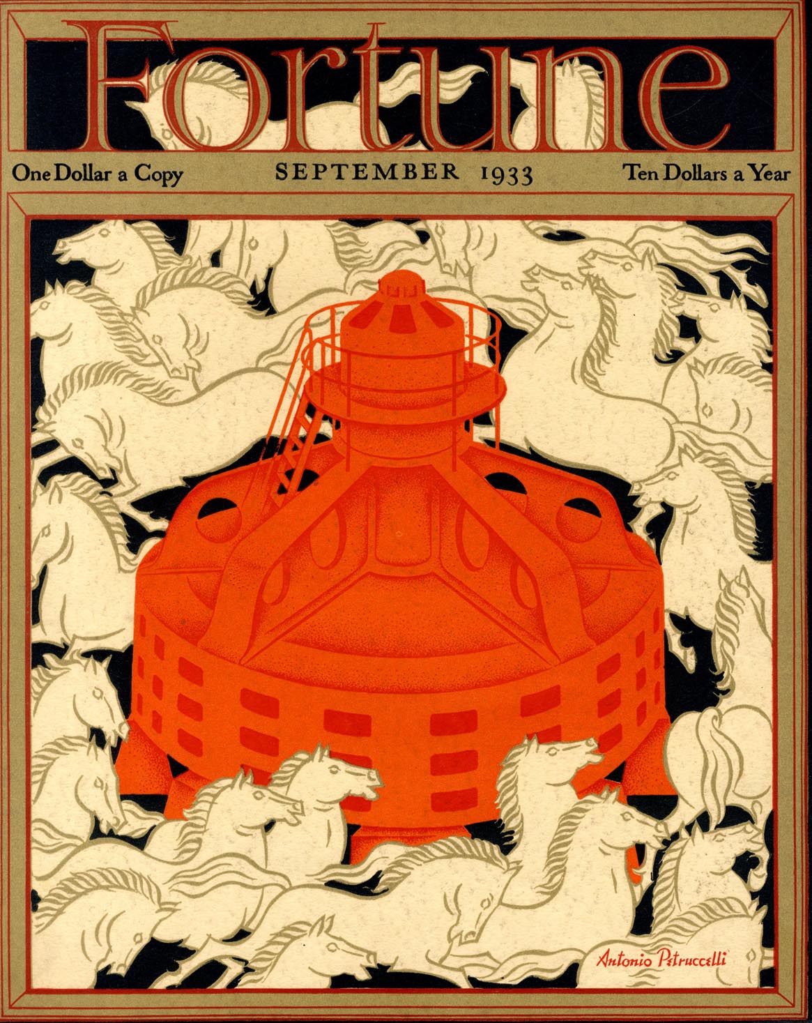
SEPTEMBER 1933"I have a special affection for this - my first FORTUNE cover, and the beginning of a memorable period. The equestrian treatment might have been better handled. However one should not look a gifthorse in the mouth, or something." |
|
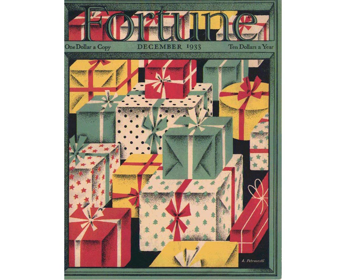
DECEMBER 1933 "My second cover - an easy one, and seasonally appropriate. Probably meant for some other magazine. I had had it in limbo and redesigned it for FORTUNE. This kind of transplanting happens now and then. The ditch digging was a rejected idea for the NEW YORKER." |
|
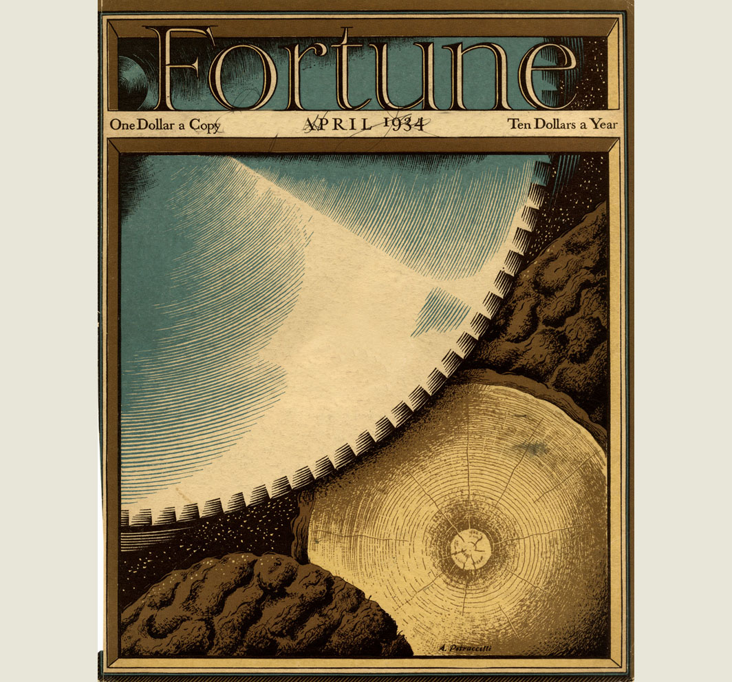
APRIL 1934, I wish I had studied log shapes more carefully. My log, endwise is too symmetrical and round. I have seen better bark shapes. Howver it says ‘SAWMILL’. |
|
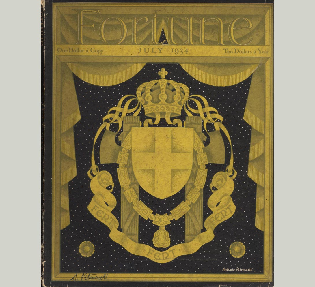
JULY 1934 This idea came at four o’clock one morning. We had to avoid political inferences, replacing a previous and more interesting design., the one I am using for the display to be made for you. I find this cover sombre and rather funereal but controversially safe, There was speculation at the meaning of ‘FERT FERT FERT’ at the bottom of the heraldic design. We never found out! |
|
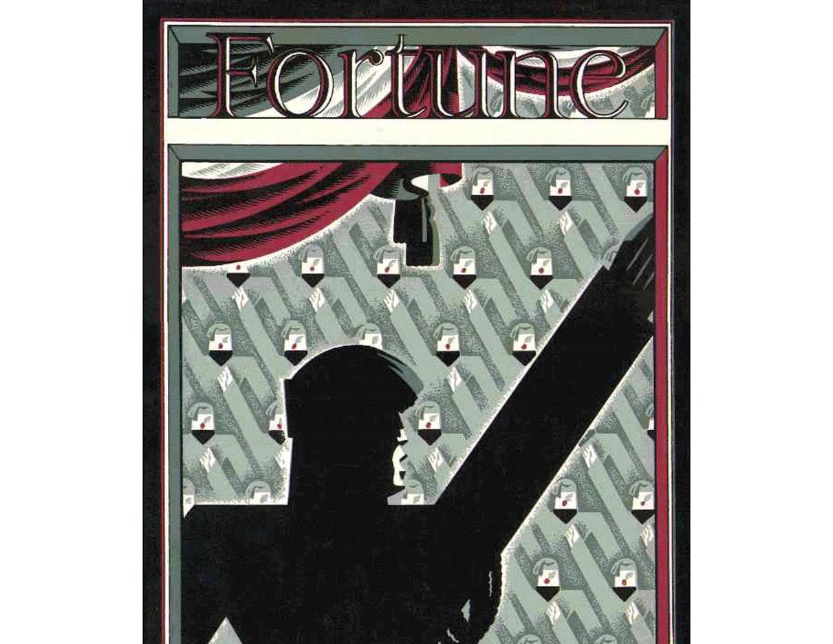
ITALY NUMBER 1934, rejected"I have an old sketch of a cover for the FORTUNE Italian issue of July 1934. The design was rejected in favor of my other submission, which was used. " This design is a typical Petruccelli, with cross hatch and stipple. In Mount Tabor Tony told me that the satirical depiction of Mussolini in this design was rejected by the editorial staff because they knew that it would not have gone down at all well with Henry Luce, owner of TIME/LIFE who at the time was a supporter of the Italian Fascist leader. |
|
OCTOBER
1934, Based on a minimum of reference material other than
a quick look and notes made at the Grand Central Station shoeshine
stand. The figures I improvised with my life drawing experience of
some help. The showshiners might have been improved.This my all time
favourite. As with water streams, I love to watch people at work, especially
physical work. I’m what
you call a ‘sidewalk superintendant’. Have you noticed how static so many portraits of people are – just staring and no action? Why not show people at their hobbies, crafts, just doing something besides looking at you blankly?I liked the muted colours and rhythm of shovelling and digging. The ditch too has a bit of undulation and earthy movement. I remember standing at a respectable distance admiring this issue displayed at the New York Times news stand. A little ego is permissible, no? |

|
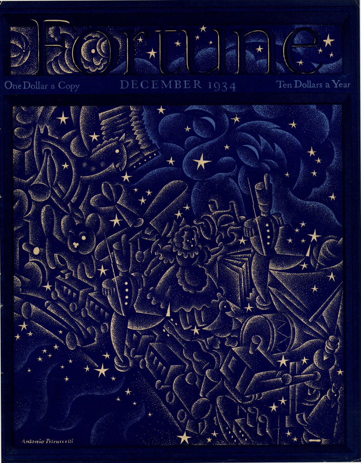
DECEMBER 1934 "When my wife and I first saw this issue displayed at Brentano's book shop we groaned. The original blues were loused up. The frame blue was much deeper making the sky recede with a rich night glow. In fact the effect is an overall single color. I should have been allowed, as with the tickertape case, to exert some command over the ink matchers regardless of their objections to interference. The same vexing problem here of definition - especially the tiny dots where they clogged. In spite of everything I think it is a good design and I found the work very pleasant." |
|
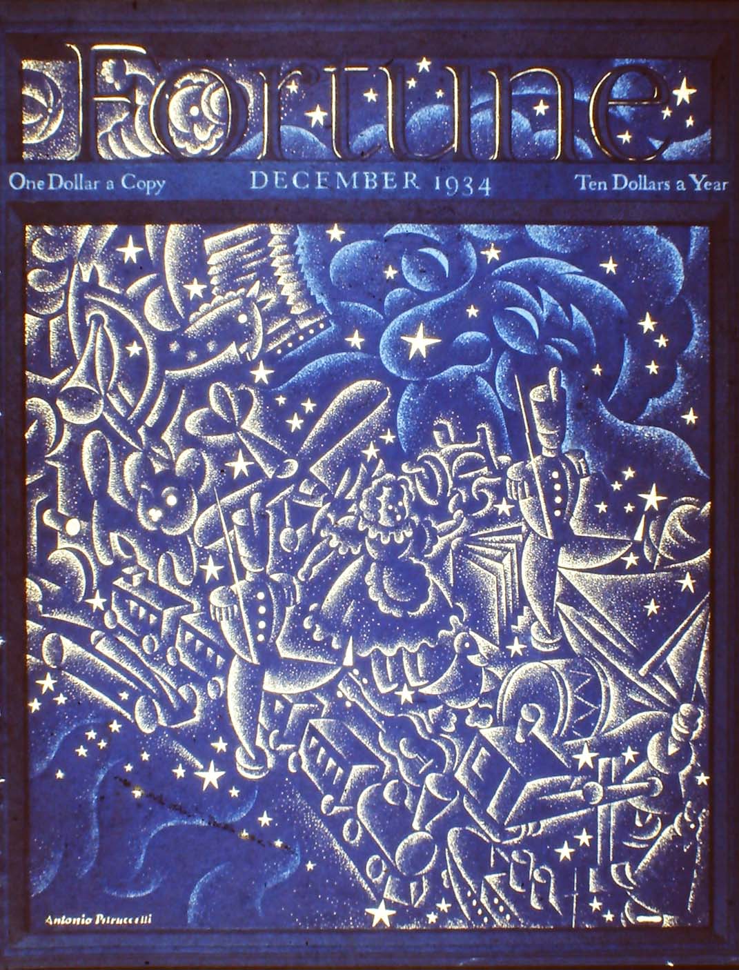
DECEMBER 1934 Art work from the Studio shows the composition as he conceived it. |
|
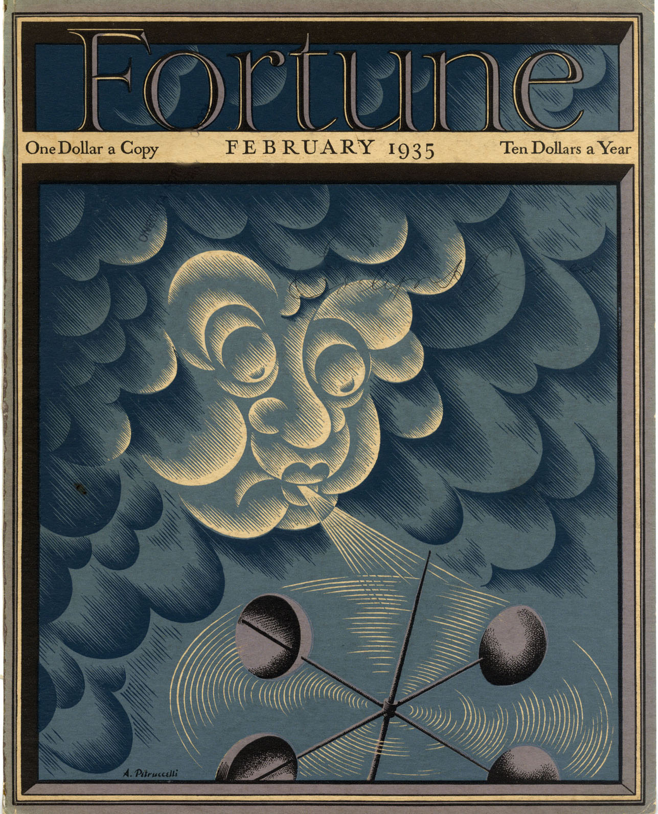
FEBRUARY 1935 I like this one. It is cold and blustery, simple and bold. The weather vane is a bit fragile and about to be blown away. I have learned to be more capable in the portrayal of such objects. |
|
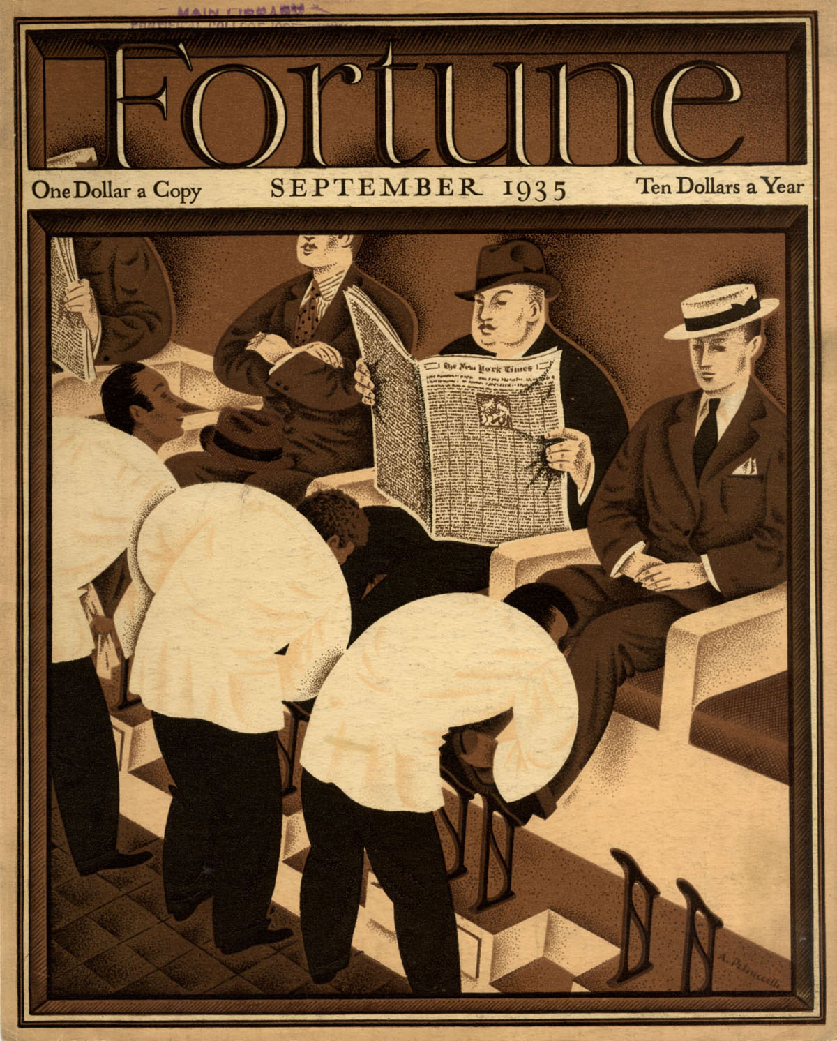
SEPTEMBER 1935 Based on a minimum of reference material other than a quick look and notes made at the Grand Central Station shoeshine stand. The figures I improvised with my life drawing experience of some help. The showshiners might have been improved. |
|
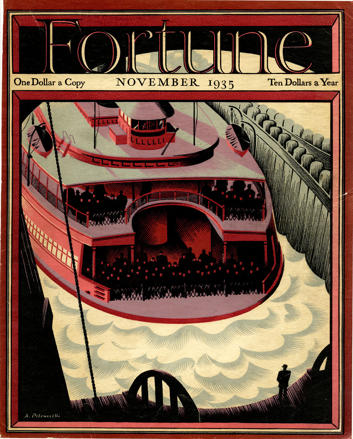
NOVEMBER 1935 This I did in a sense to celebrate my family’s move from the city to the N.J. suburbs, with no regrets. The ferry rides across the Hudson were a delight. Commuters returned to NJ at the end of the day’s work found a short but relaxing 15 minutes respite before boarding trains for home. This system of transportation was discontinued some years ago but there are rumours of its revival. I have a nostalgic sentiment for this cover. |
|
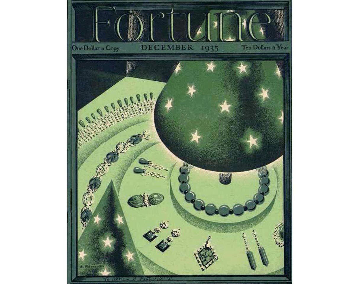
DECEMBER 1935"The problem here - as in other cases - was to convincingly suggest the glamor of jewellery under artificial light in flat colors. This again might have profited with the use of airbrush. The greens did not match any color swatches - thanks to the unimaginative ink people. But it's festive." |
|
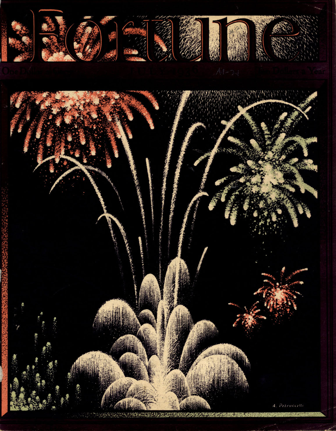
JUNE 1936 Another of my favourites. In the technique I most preferred. Lots of cross hatch. Patriotic colors and the confusion that goes with political sindigs. Today’s banners and signs are more varied, colourful and expensive. The frame lends an added festive touch with its stars. All hail! |

|
JULY 1936" A natural for the 4th. The trick here as with the others was to give the feeling, within the technical limitations of flat colour, of luminosity and sparkle. Here of all places, use of the airbrush would have been justified. All things considered,it turned out satisfactorily. As with all letterpress/gravure printing, the pressure of the plates tends to squeeze the ink a fraction causing a slight loss of definition." |
|
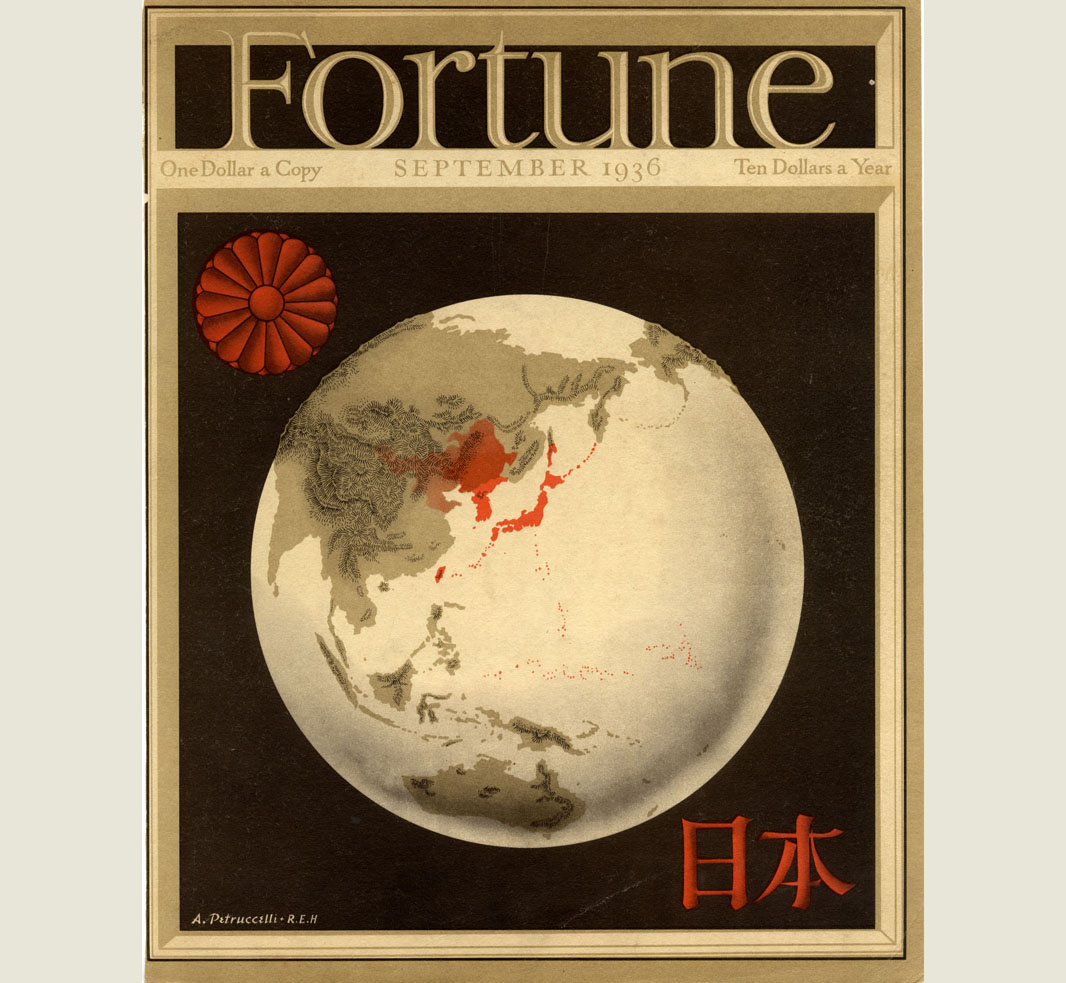
SEPTEMBER 1936 This was a collaboration with Ricky Harrison, who did the basic map projection and I the final art. A small but significant detail had to be considered. The royal crysanthemum had to have the right number of petals. Believe it or not, there was a protest from the Japanese that we had erred. In fact our count proved correct, averting an international crisis. Offset. |
|
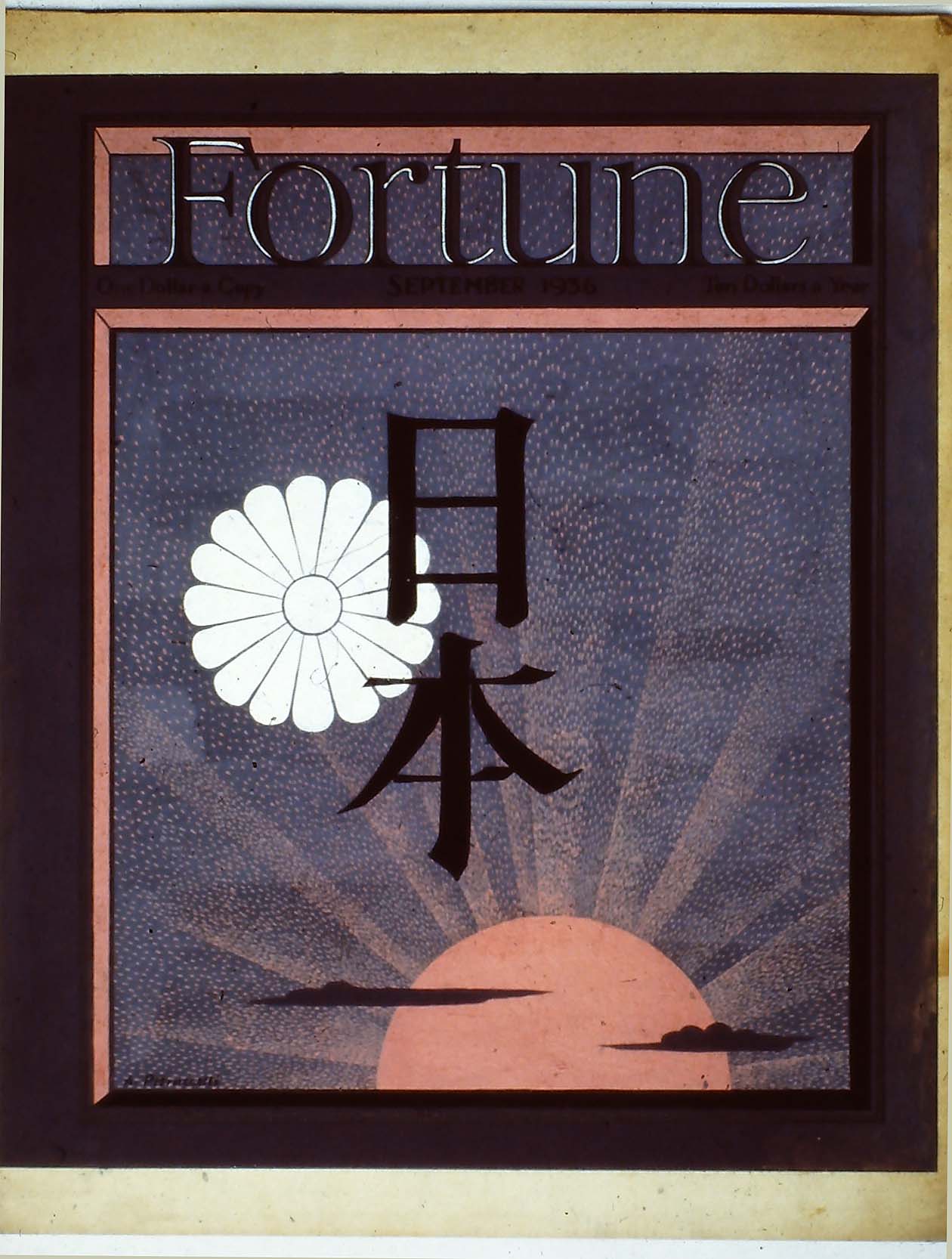
SEPTEMBER 1936 JAPAN ISSUE variant artwork |
|
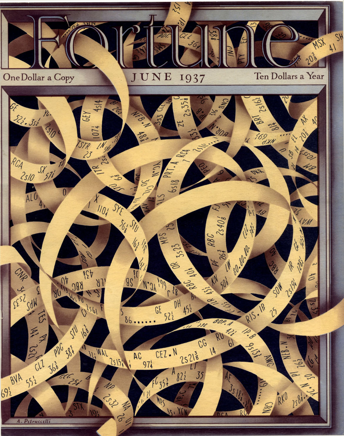
JUNE 1937 "Visually concocted with many revised tracings. The quotations copied from real figures. We had trouble with the ink people. The first proofs were terrible, with a poisonous velvet background. I was sent to help the color mixers get the desired hue. My presence was not cordially received (professional jealousy). I suggested adding black, and more black, to their horror, but it worked. I call this one the 'noodle cover'..." |
|
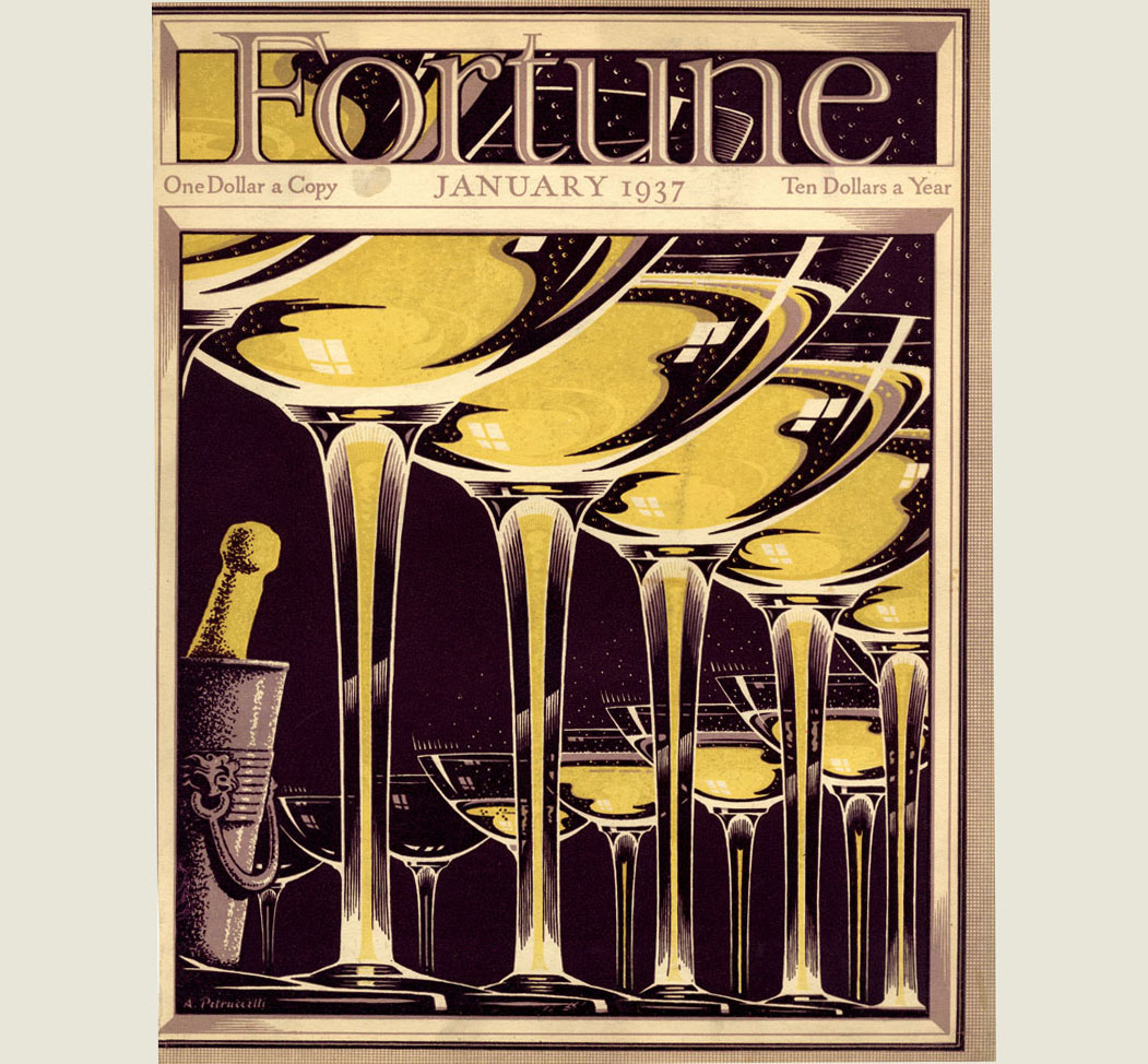
JANUARY 1937 " When the first sketch was approved, I was given $5.00 to buy a bottle of champagne and a few sample glasses, these to help me get the effervescent and bubbly look and glass brilliance. On finishing I felt I deserved a drink, but the contents had gone flat - so, down the drain. I like the receding curve of the glasses and good color match. It is bold, simple and says 'whoopie'....." |
|
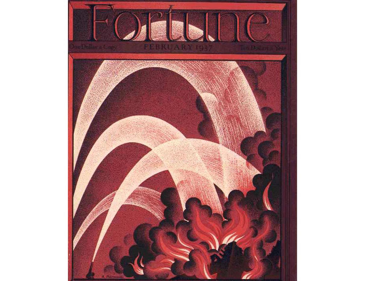
FEBRUARY 1937 I was always intrigued by water displays, even when sanitation men flushed the streets. Admittedly, firefighting streams are less graceful, but artistic licence makes for a rhythmic design. The use of cross-hatch is here fully exploited and the colors suitable to the occasion. One of my favorites. Offset.." |
|
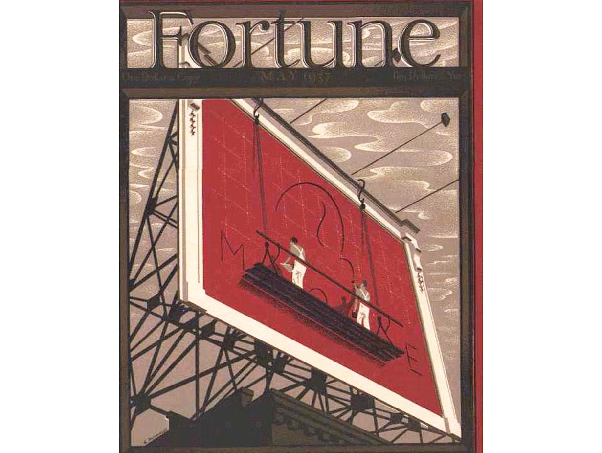
MAY 1937 "An effective design and pleasing color. The billboard rendering received plaudits from the advertising people for its structural correctness. No great achievement - it was based on authentic sources." |
|
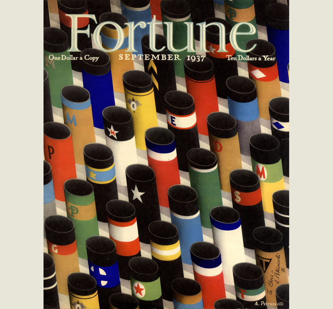
SEPTEMBER 1937 "My first full full-color cover without the frame, done mostly with airbrush. The stacks, researched from FORTUNE files, had to be authentic. They stacked nicely in my design and clearly introduced the contents within. Colors restricted by the obvious. Offset." |
|
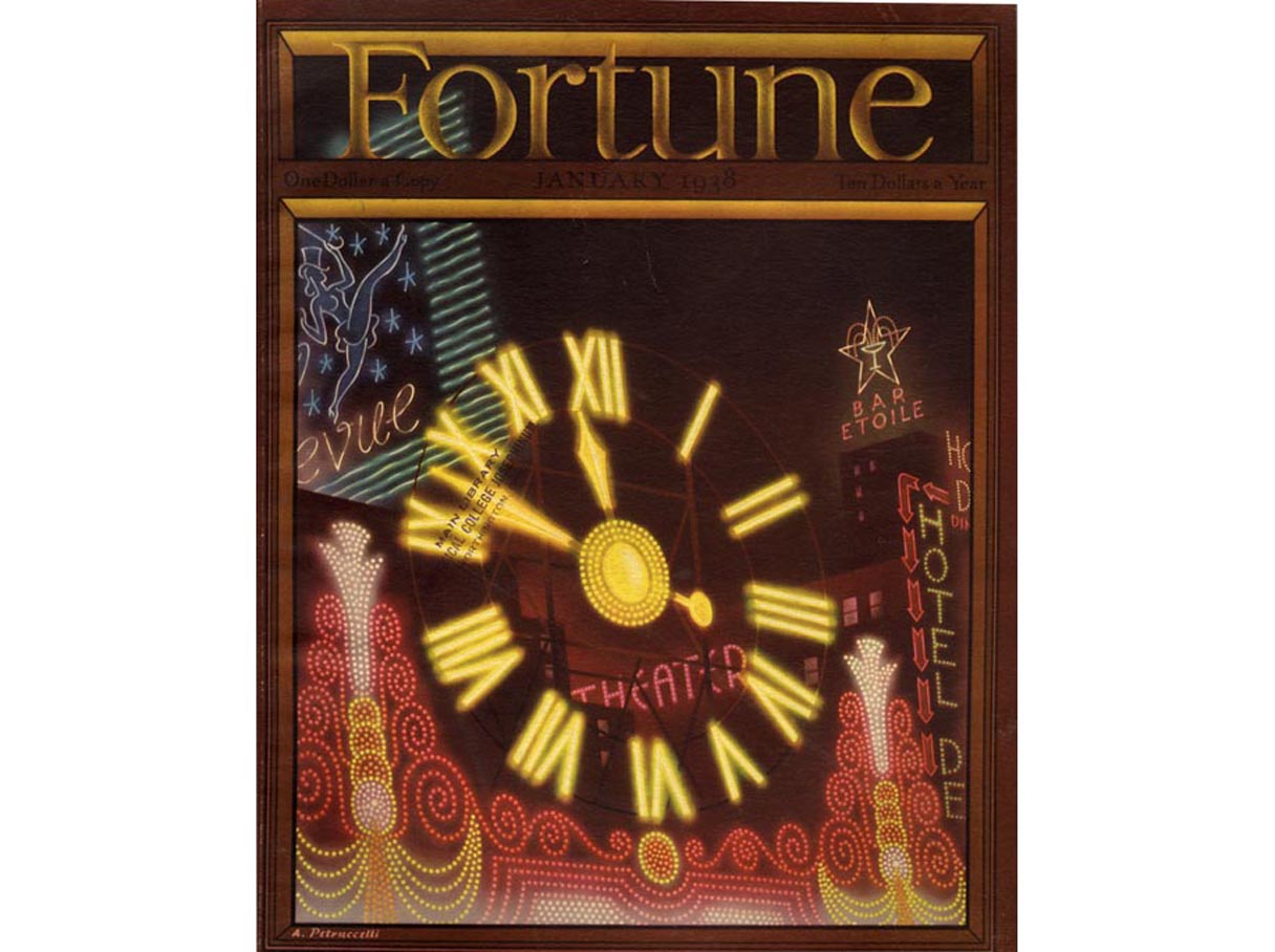
JANUARY 1938 Done entirely with airbrush. The glow of neon signs would have been less effective if done in the flat colours of earlier covers. It was fun to do and the repro was excellent. It suggests Broadway or Piccadilly – a bow to London. |
|
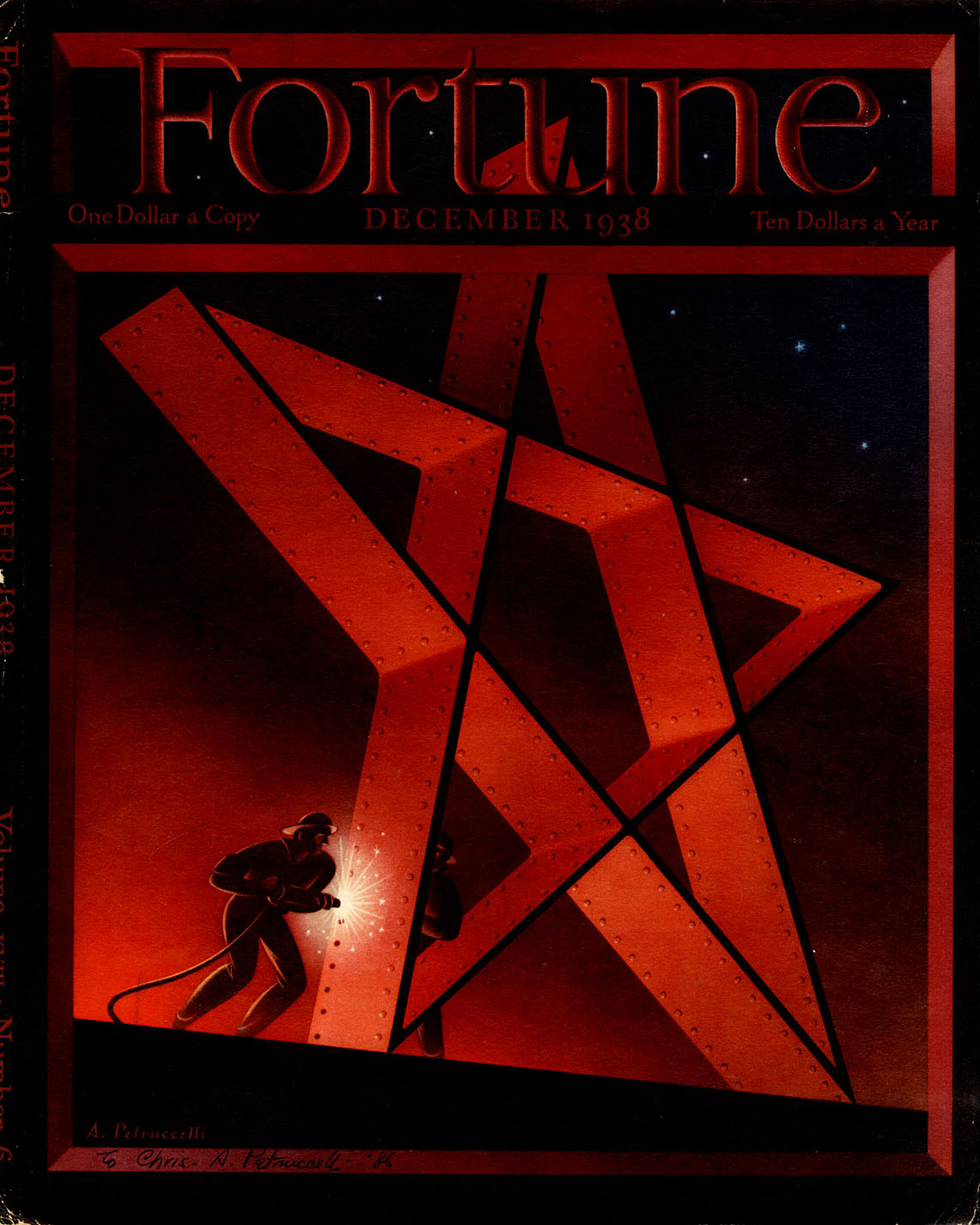
DECEMBER 1938 This cover takes the cake for the near impossible. Midafternoon, one fall day, Hank Brennan approached me with the urgent need for a Christmas cover. “When due?” I asked. “Last week…”answered he, meaning ‘right away’. We settled for tomorrow. The pressure was on and an idea had to be hatched, pronto. I recalled doing a small star design for a TIME Christmas promotion. The suggestion of the adaptation to our purpose was approved. I spent an hour or two redesigning it to fit the cover space, but ran into perspective difficulties and little time to monkey around. I solved this problem by making a three dimensional cardboard model. My camera handy I took twelve two and a quarter by two and a quarter black and white exposures of required angles under available light. These were quickly processed by the TIMES photolab – three negatives were selected for enlargement, and of these, the best one for my use. At about 6 PM I got to work, with stencils (friskets) and airbrush. Up all night and finished at 12 AM. A waiting messenger whisked it away to the printers. Amen ! Overnight quickies were not unusual. I call this one ‘The Star of Bethelehem Steel…’ |
|
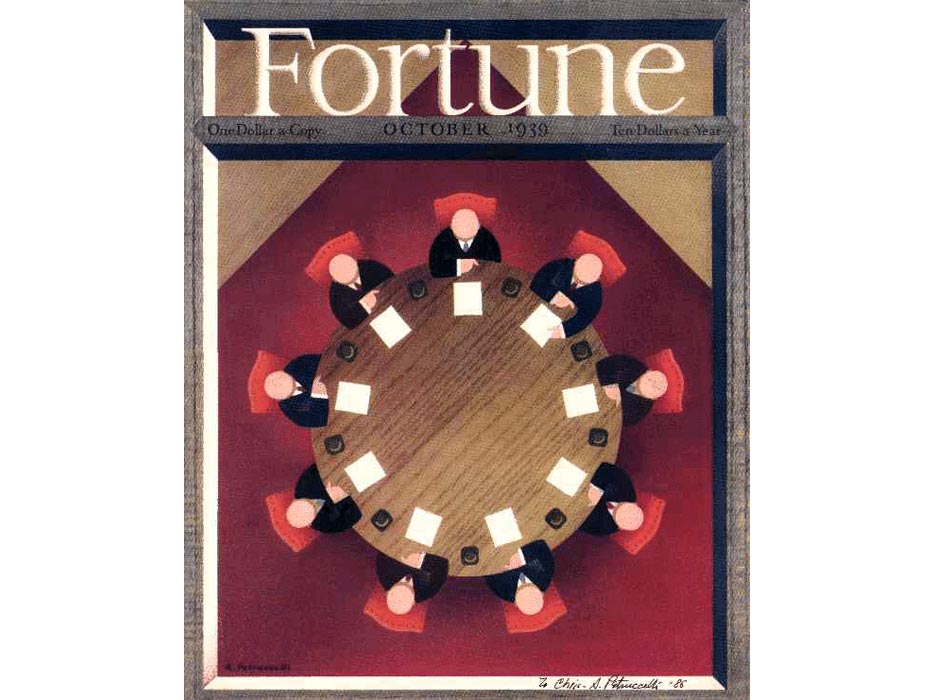
OCTOBER 1939 "This was one of the few not done in gouache. I used Japanese wood-grain papers as paste-up which was fun doing. It was used for all kinds of FORTUNE promotion. I have the original and am waiting for its disintegration." |
|
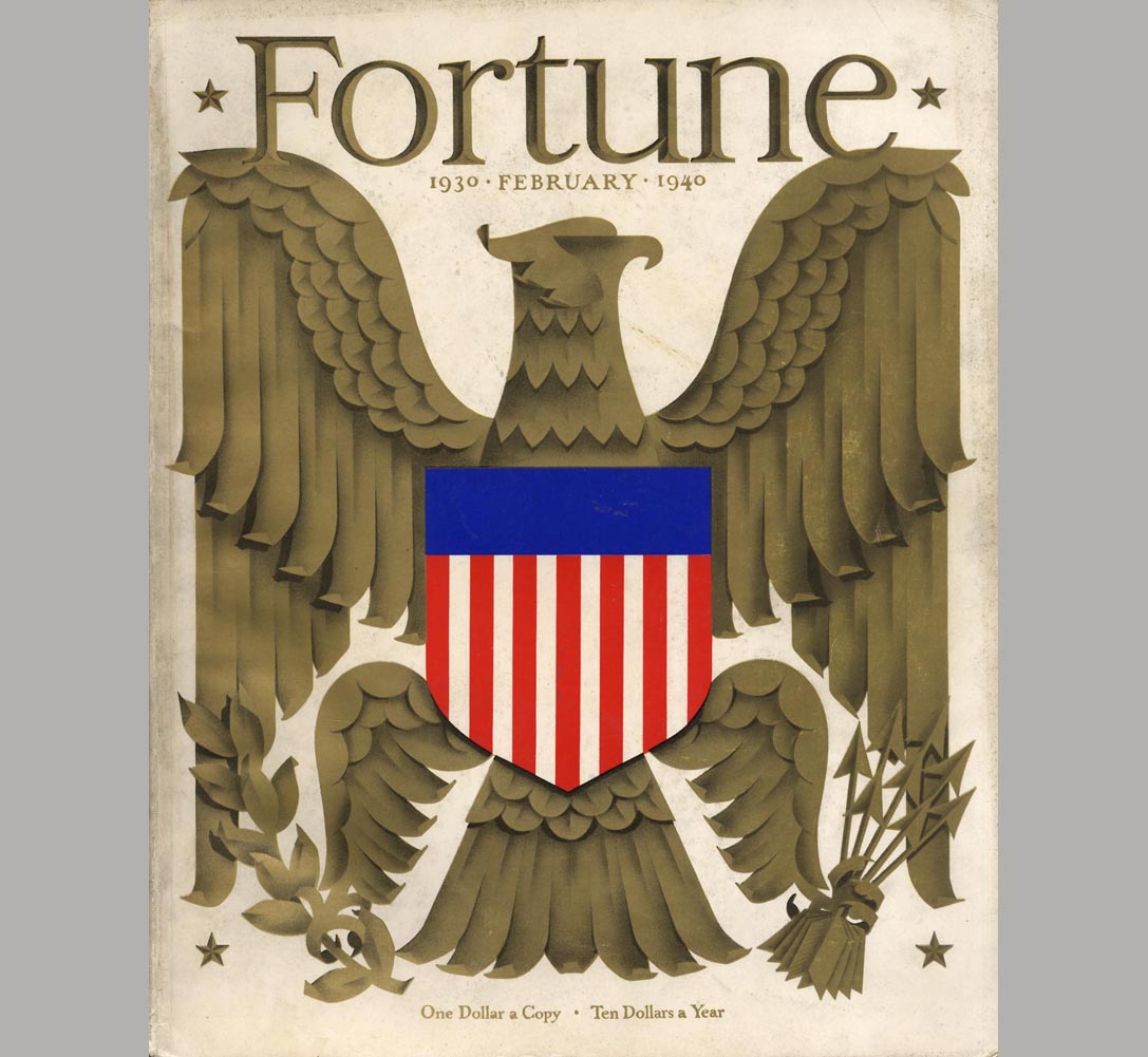
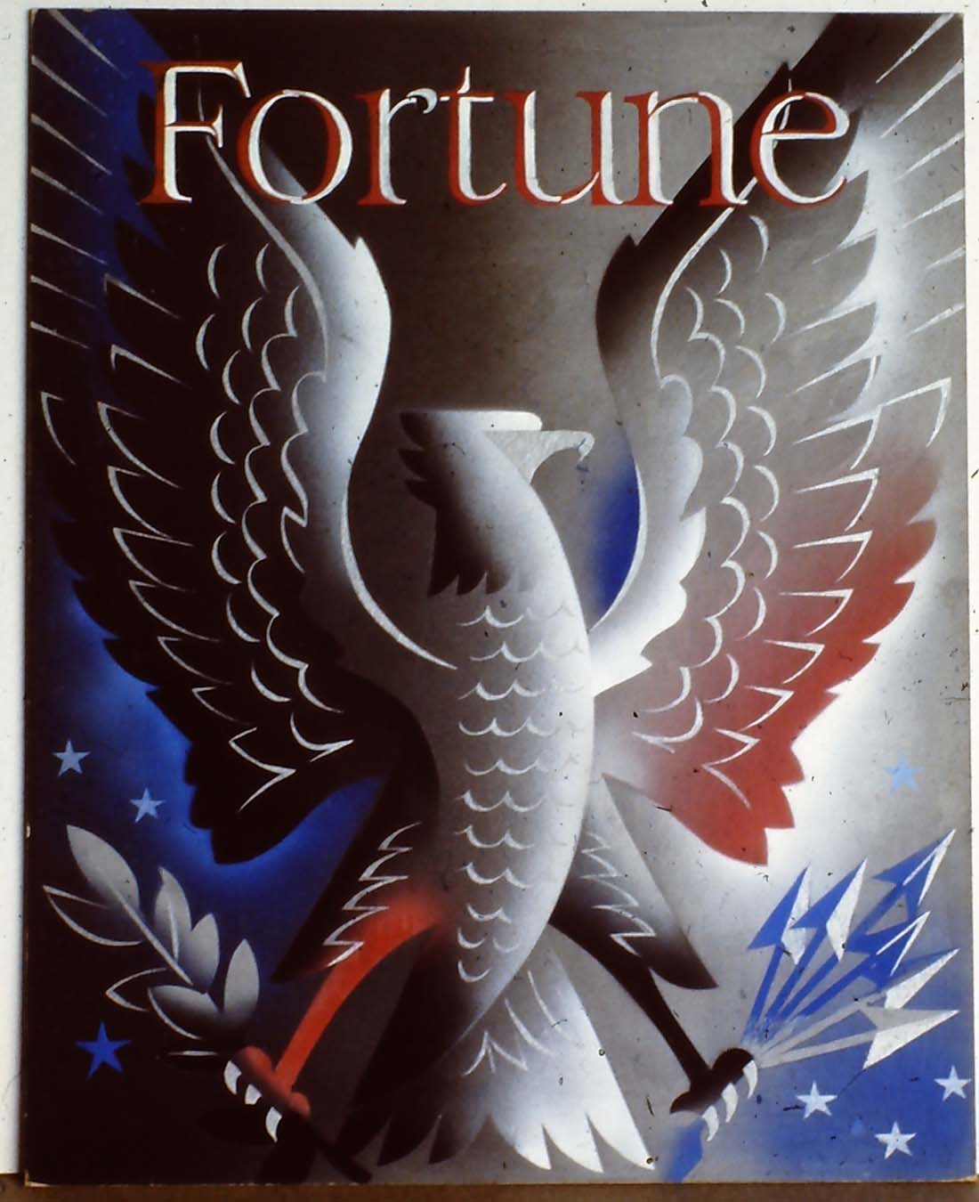
FEBRUARY 1940 This was a Hank Brennan assignment. He wanted a decorative stylized eagle with silver or gold for one color. I did three versions and of course the one I least preferred was used. technical problems with metallic ink made this a pesky and expensive job for the printers. If nothing else it is shiny. Offset. |
|
FEBRUARY 1940 AMERICAN EAGLE variant |
|
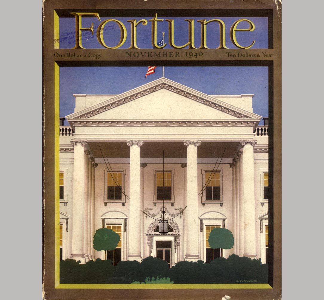
NOVEMBER 1940 another assignment. From a photograph. Good but no novelty. Offset. |
|
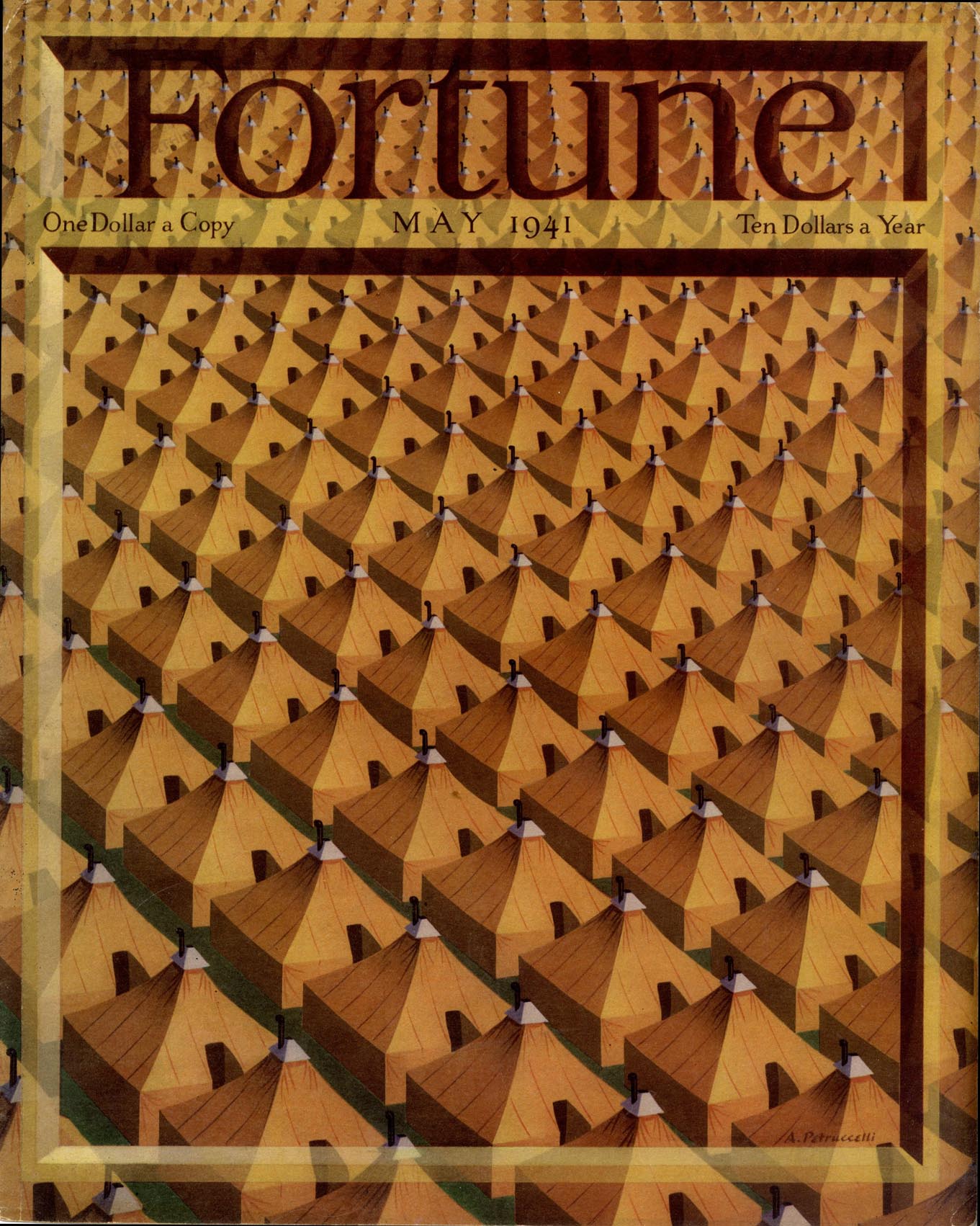
MAY 1941 under canvas "This was a challenge in perspective, done the hard way - trial and error. The diminishing tents had to line up true. I wanted to suggest the congested regimentation and drab monotony of military camp life. In the spirit of monotony I made endless tracings and revisions before the final result. Good repro in offset." |
|
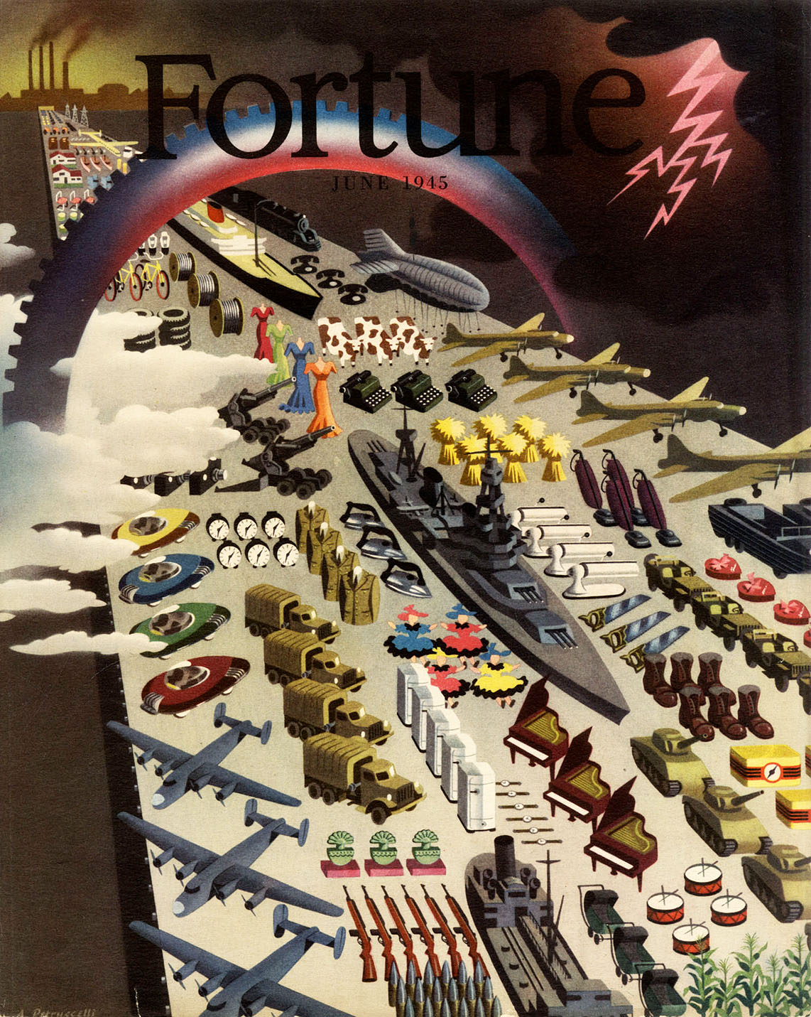
JUNE 1945 An assignment calling for a busy design showing all but the kitchen sink. The result speaks for itself – not my worst, not my best. Offset. |
![]()
back