![]()
back

JERRY COOKE
| NABISCO, THE DOUGH IS RISING, JUNE 1948 |
| MADE IN MILWAUKEE, NOVEMBER 1950 photo-essay | |
| FORGING : INDUSTRIAL SPECTACLE, MAY 1950 photo-essay | |
BIG MONEY AIRLINE , DECEMBER 1951 photographs |
|
| TWELVE MILLION NEW TELEPHONES , JUNE 1950 three photographs | |
| CARROTS TO CHLORINE , JUNE 1951 photo-essay |
| GREYHOUND, STILL GROWING |
SINGLES
| CHARLES P.TAFT, August 1947, single image US Protestant Lay Leader | |
| NEW YORK CENTRAL'S BUFFALO STATION , MAY 1954 one photograph |
| SPIRAL ANTENNAE , July 1951 (article on Electronics, single) | |
| ABBEY STEEL WORKS, MARGAM UK 1953 |
| ANNUAL HOME COMING DINNER, SHELBY COUNTY |
| COCA COLA, the Boss at his Desk |
| Another fluid cat takes form, Texas Co., at Camden NJ |
| M.W.KELLOGG Engineers of Energy, with Barrett Gallagher |
Jerry Cooke is described variously as a Life Photographer, and a proud ornament of Sports Illustrated. I am amazed his work for FORTUNE is so seldom quoted. He had arrived in America as Yuri Kutschuk in 1939 from his native Ukraine. His aunt Celia had worked for a Berlin photo agency and started the PIX Agency in New York for whom the newly minted Jerry Cooke started work with the Baby Rolleiflex his aunt had given him.He became Eisenstadt's assistant, and in LIFE you can find them both spinning helplessly on rides at Coney Island. He was a founding member of the Society of Magazine Photographers (now ASMP) , gaining for them a status akin to a Trade Union. In between travels in America among Factories, Bridges, Dams and other sublimities he travelled abroad extensively, speaking as he did five languages. He became Director of Photography for Sports Illustrated and contributed 47 covers. he was a regular feature in the Landscape at the Kentucky Derby whoich he never missed, and always from the vantage point of the Winning Post. Something of his spirit and generosity can be glimpsed from his kindly letters to a floundering fan of FORTUNE shown beneath.
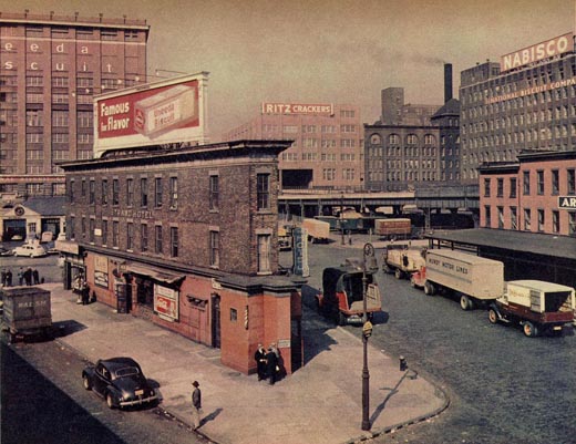
WHAT SHOULD FORTUNE PHOTOGRAPHS DO? Walker Evans writes of the lead image (see above) to the Nabisco feature. "The picture is quiet and true. Since I am writing about photography let me point out that this picture is a better part of the story at hand than either a drawing or a painting would be. There is a profitable and well-run cracker firm in a sweaty part of the town, there is a knot of men talking on the pavement about anything but crackers, amidst the irrelevant trucks. This is where Mal-o-Mars are cooked and this is where last week's newspaper meets the gutter too. And the Strand Hotel becomes famous for flavour. My point is Fortune photographs should take a long look at a subject, get into it, and without shouting, tell a lot about it." to R.D. Paine, 23.7.48 (Walker Evans at Work). |
TWO LETTERS TO CHRIS MULLEN
Jerry Cooke born 1921, died 27.10.2005. This tribute is dedicated to Peter and Lauren McGrath. I am delighted that my FORTUNE material on Mr.Cooke alerted his family to less familar parts of his long and distinguished photographic career. |

LETTER ONE JERRY COOKE 161N EAST 82 ND ST NY October 24 1984. The arena as you put it which Fortune provided in those years was a very fine one. 2 strong art directors, Will Burtin and Leo Lionni, were outstanding men. Quite different but first class. The sort of layouts we are talking about here are hard to come by these days. There was space for good pictures. I personally was quite happy with Fortune in those years and so were my colleagues. As for the style those were still the days of large format cameras and color films. Most of the pictures you sent me were done with 4 x 5 Demidorff and Linholz which meant they had to be set up, often posed. 35mm photography was still not too acceptable in color and though LIFE was using it a lot but not necessarily for industrial subjects. I have done and still do a lot with Sports Illustrated, in fact I was their Director of Photography for 4 years. It is of course very different work from the Fortune portfolios. Action Sports photography does indeed need a sharp sense of timing which usually is not so necessary in industrial work. But above all one has to have one’s own point of view, one’s opinion, visual and editorial, for any kind of photography. Of the work you sent me the Forging Story is my all time favourite It would be very interesting to see how how such a story would look today given the difference in camera equipment, film and lenses, and probably many changes in the Forging Industry. The Milwaukee portfolio took me two months. I visited each plant for a day to look, then another one to shoot. I even rented a summer cottage near Milwaukee for weekends.
LETTER TWO JERRY COOKE 161N EAST 82 ND ST NY October 24 1984. 1. I think the switch from large format to 35mm probably came in the late 50’s and early 60’s partly because of faster and better films and partly because magazines finally realised that they could handle 35 mm in terms of engraving, reproduction etc a lot of my lighting was done with large Flashbulbs all wired together often as many as a dozen or more Usually it was done it what we called the ‘OPEN FLASH’ technique that means camera on tripod, shutter opened, Flashbulbs set off , shutter closed. This contributed some of the available lighting into the exposure, and was (and is) particularly effective if you have things like hot flow steeL, welding sparks, etc which cannot be illuminated but must make their own impression onto the film - It was time consuming and cumbersome but often very effective. Each flashbulb had to be changed after each exposure. 2. My point of view was (and is) mostly visual when faced with anything, industrial or otherwise. I like to think I see things and people my way as indeed probably everyone does. The trick is to translate the way you see onto film and hope it comes out the way you wanted it..
3. re Milwaukee, I believe the subject, the factories were chosen by the editors. I had my list of I think 26 . The rest were up to me. I looked at each, decided what to shoot and did it. No retakes, no going back. Everyone loved the project. It was a Civic high. I don’t know who wrote the captions, someone at the magazine, of course. I spent a day in each factory just looking. I certainly understood what was going on before taking the pictures. 4. I am not familiar with Aikins and Rittase. Bill Vansittanrt was what I considered a journalistic photographer, I don’t think he had a very strong visual sense. Ritchie, from what I remember, always struck me as almost a PR type photographer/ everything was new and shiny sort of. Bourke-White did lovely black and whites. I don’t believe she did much industrial color because she started shooting for LIFE in 1936, then there was the war and she didn’t do too much after that. But she had a strong sense of the dramatic, the juxtaposition of man and machine, which is really the heart of industrial photography, at least as I see it. 5. re black and white, and color, that was and is determined by the makeup of the magazine. If the story is planned for the color pages, you shoot in color. If b and w you shoot in b and w. Nowadays it is predominately all color. Occasionally a portfolio might be just right in Black and White, for whatever reason or taste, e.g. subject matter, mood, whatever. But that’s relatively rare. As for the dominant color attracting the eye, well yes it probably does in a way but then that is what our world is like really, it is in color so why deny it. A red sunset will indeed catch the eye. But you can’t get away from that What I do object t to is for instance dressing up some workers in colourful shirts, or things like that. I am a great believer in leaving things the way I find them when I photograph rather than changing the mood by whatever means. No National Geographic red checked shirts for me. |
|---|
![]()
back