 |
 |
 |
 |
||||||||||||
 |
 |
 |
 |
 |
|||||||||||
 |
 |
 |
 |
 |
 |
||||||||||
 |
 |
 |
 |
 |
 |
||||||||||
CLASSIC BRAND CHARACTERS - an introduction. Brand Characters that survive, flourish, change with the customers and their aspirations, retain their (simple) characterisation and still manage to exert a peculiar influence on the public.
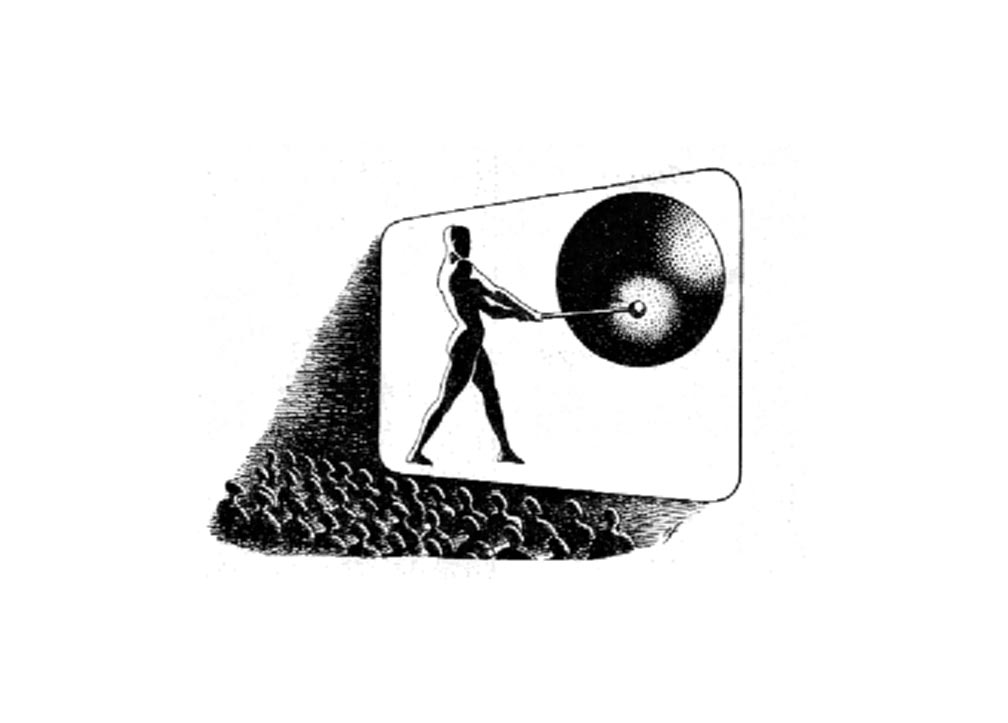
Snap, Crackle and Pop The Man with the Gong- J.Arthur Rank Organisation
Limited, Film Divisions. Mister Therm - The Gas Council January 1954, 4 x 5cms.
Mr. Therm had been created by the great British illustrator Eric Fraser
for the Gas, Light and Coke Company in 1931. The brand character was
used by the postwar Gas Council. In 1962, Colman, Prentice and Varley
won the account and made the radical move of pensioning off the bright
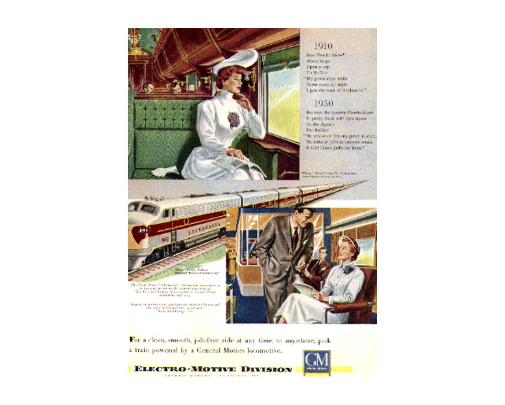
fluttering form of Mr.Therm. Bertie Bassett Liquorice Allsorts- UK sweets Phoebe Snow of the Lackawanna
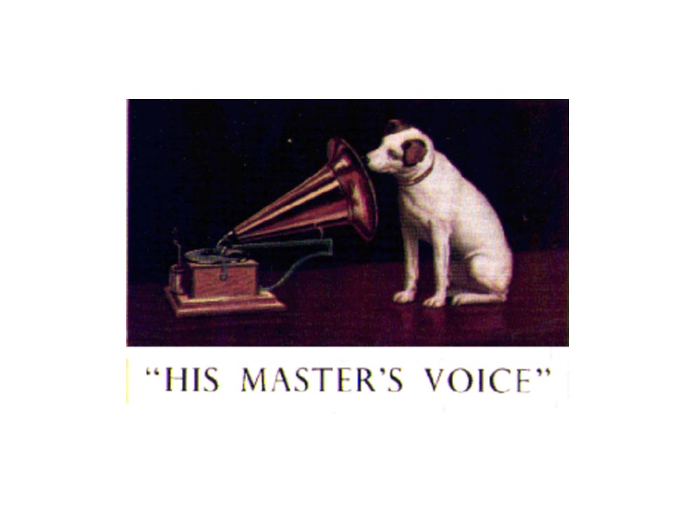
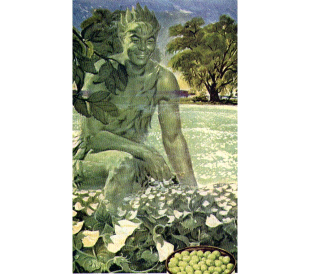
BOTTOM ROW Nipper of HMV The Quaker The Jolly Green Giant Minnesota Valley Canning Company December 1949. "How big is tenderness ?" The Giant never developed as a narrative character but was content to loom as a mysterious presence holding monstrously large vegetables. This is a fascinating problem of scale - how to make the produce look appetising - grown and distributed by the Giant, yet not drained of succulence ? It's a BIG problem. The pea the size of a basket ball in a canoe sized pod is not, if you really think about it, very appetising. Green Giant is the largest packer of peas and beans now owned by the Pillsbury Company. The Giant was first drawn and the image patented in 1924 when he looked like a tiny man with big pods. In the 1930's under the skilled supervision of Leo Burnett, he became gigantic, more glamorous and exchanged a tatty Fred Flintstone hair suit for a very racy leaf costume. The Green Giant became in the process "Jolly" . here in his most glamorous incarnation. 11.5 x19cms June 1947 Giant Green Peas Brand . "There's a color rhapsody in the soft green of springtime..." Johnny Walker Blended Scotch Whisky.
|