|
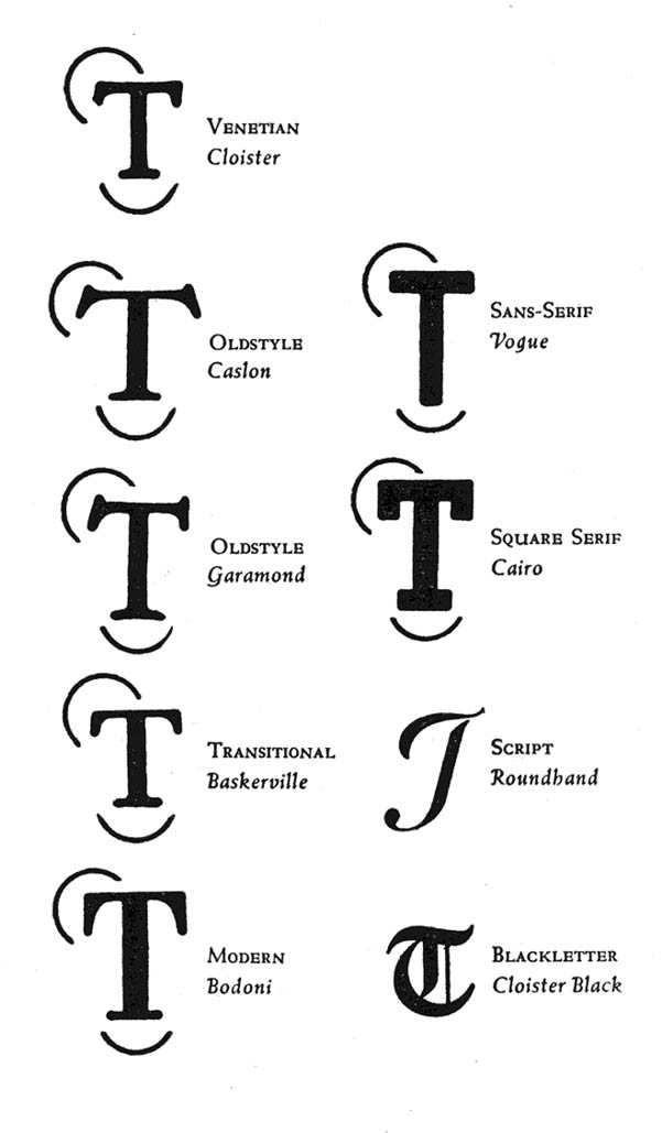
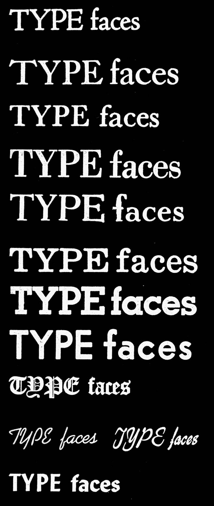
Shapes of Serifs and Type Groups.
In descending order;
1. VENETIAN (Cloister)
2. OLDSTYLE (Caslon)
3. TRANSITIONAL (Baskerville)
4. MODERN (Bodoni)
5. 20TH CENTURY (Edmont)
6. 20TH CENTURY (Edmont)
7. NEWSPAPER (Ideal)
8. SQUARE SERIF (Cairo)
9. SANS SERIF (Vogue)
10. BLACKLETTER (Cloister Black)
11. SCRIPT Kaufman Script and Grayda)
12. DISPLAY (Lydian)
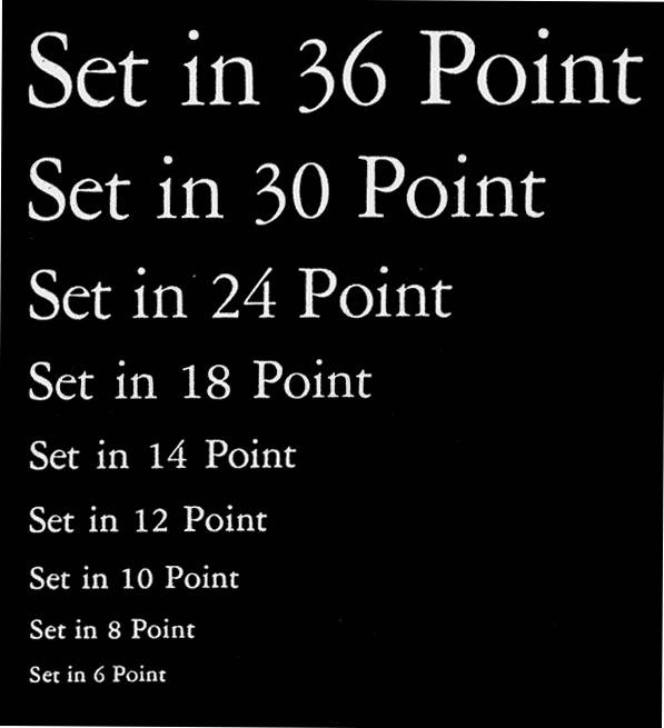
Size of Body
This image not to size - will give you the respective proportions. A
"point" (unit of measurement of siz) is nearly one seventy
second of an inch.
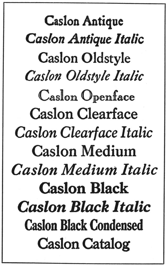
Weight
"Type families have the same general appearence and fundamental
design , and may include light, medium, bold, and extrabold or heavy;
light condensed, medium condensed, and extrabold condensed ; and light
expanded, medium expanded, and extrabold expanded - with italics weights
added to each of these weights."
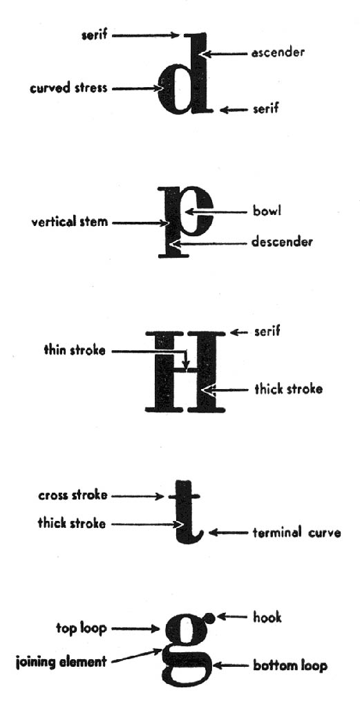
Characteristics to Consider
1. The shape of the serifs (the short cross lines at the ends of the
main strokes).
2. The design of the individual letters ( lower case/ upper case ; punctuation
etc).
3. Size of body.
4. The amount of ink transferred to the paper.
|