back
TALWIN MORRIS
 |
A FIRST SELECTION OF BLACKIE BINDINGS |
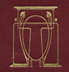
MACKINTOSH FOR BLACKIE
|
CHARLES RENNIE MACKINTOSH FOR BLACKIES |
SERIES NAMED
|
THE RED LETTER POETS |
|
THE RED LETTER RELIGIOUS TEXTS I |
|
THE RED LETTER RELIGIOUS TEXTS II |
|
THE RED LETTER SHAKESPEARE |
|
THE RED LETTER LITERATURE |
|
THE CROWN SERIES |
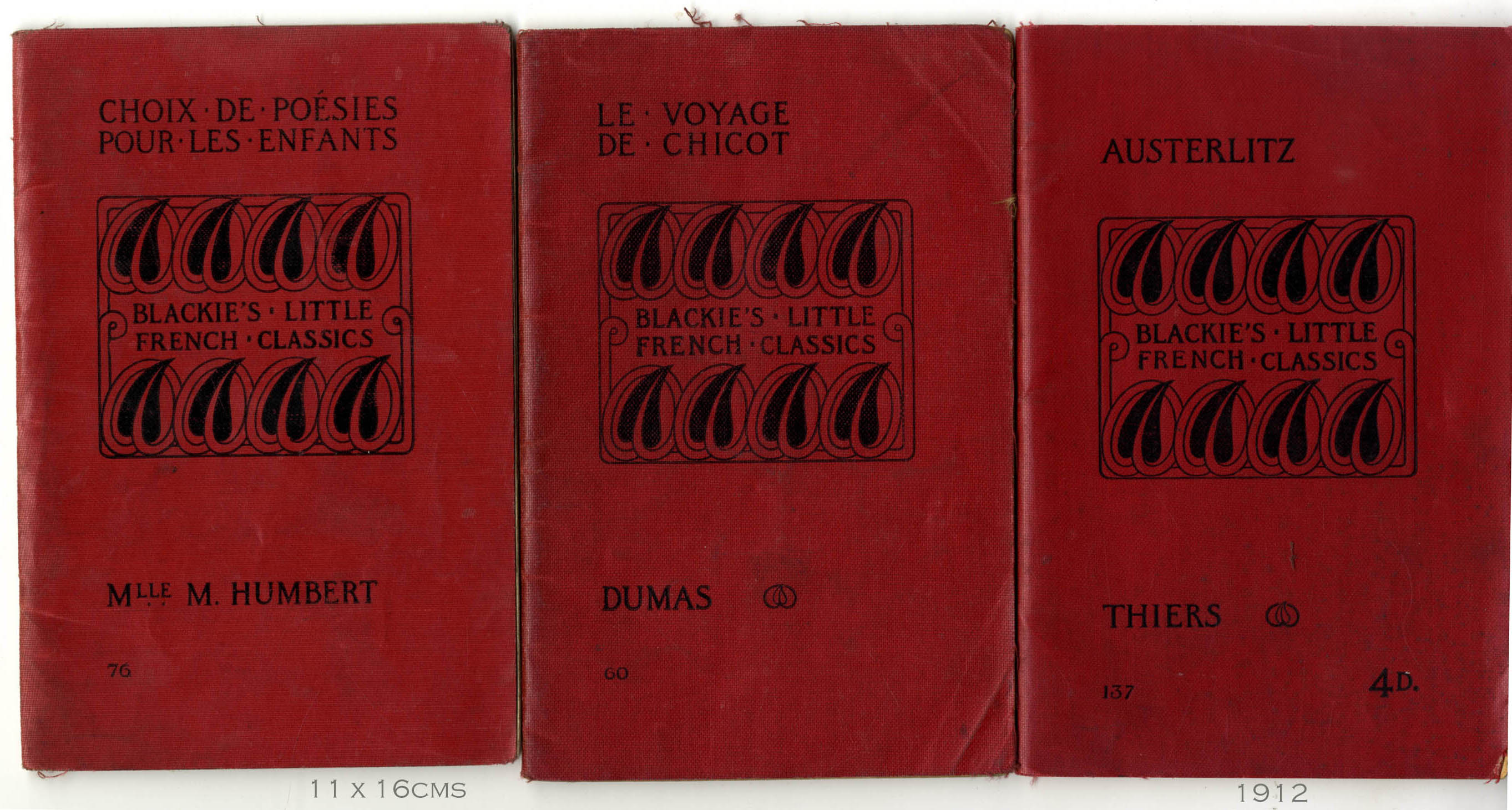 |
LITTLE FRENCH CLASSICS (SINGLE) |
|
STORIES OLD AND NEW |
|
BLACKIE'S LIBRARY OF FAMOUS BOOKS |
|
THE PALMERSTON READERS |
|
THE PLAIN TEXT POETS |
|
THE PLAIN TEXT SHAKESPEARE |
|
BLACKIE ANNUALS FOR CHILDREN |
|
COMMISSIONS FOR THE SILVER STUDIO ; HARRY NAPPER AND OTHERS |
BY SHAPE
|
TENDRIL AND ROSE |
|
ASSYMETRY AND SPIKES |
|
THE RIBBON MOTIF |
|
SYMMETRY AND COLOUR |
|
BIRDS MOTIF, BLACKIE'S POETRY |
|
BUDS AND BADGES, LITERATURE |
|
DENSE FOLIAGE |
GENERAL
|
CINAMON'S SOTHEBY'S SALE |
| STUDIO SPECIAL, MODERN BOOKBINDING 1899/1900 | |
| MY FIRST SCREENS |
INDIVIDUAL TITLES
|
MENU |
WORK FOR CASSELL
|
BATTLES OF THE NINETEENTH CENTURY 1901 |
DESIGNING FOR GRESHAM
|
MAIN MENU (SEVERAL GROUPS) |
|
FROM A SPECIMEN BOOK |
VERE FOSTER SERIES ( a source of wealth for Blackie's)
|
VERE FOSTER COPY BOOK, BOLD WRITING |
|
VERE FOSTER DRAWING BOOK, LANDSCAPE AND MARINE |
|
SOME BINDINGS - INFLUENCE ON THE UK BOOK TRADE AFTER 1895 |
ARTICLES, THE GLASGOW SCHOOL AND BOOK DESIGN
|
GERALD CINAMON, THE PRIVATE LIBRARY 1987 |
BLACKIE AND GRESHAM CATALOGUES
|
BLACKIE ONE TO FIVE |
| GRESHAM |
COMPARATIVE DESIGN WORK
|
M.G.LIGHTFOOT, ARTIST early work when working as a commercial artist |
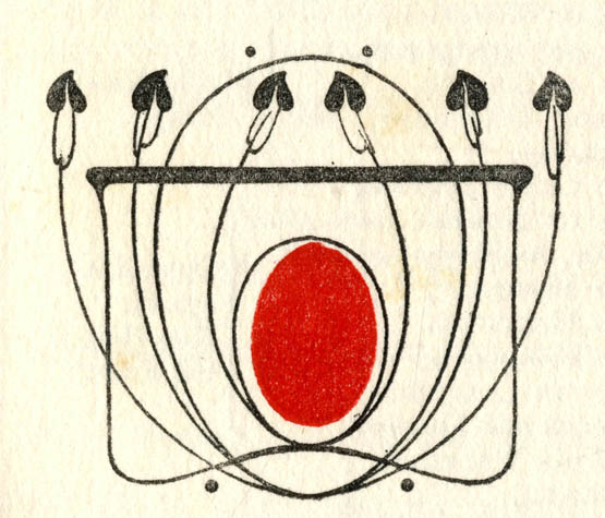
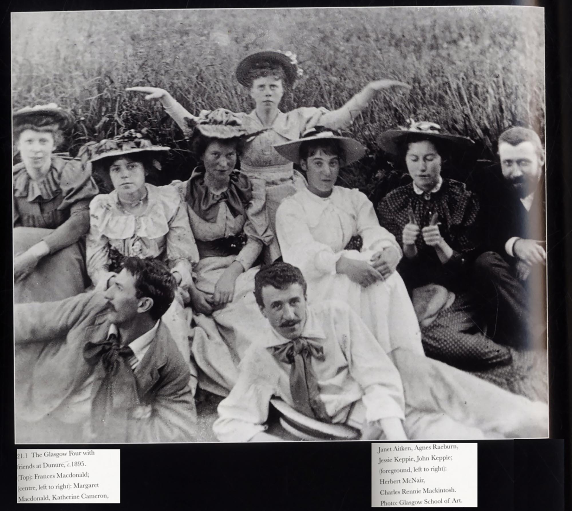
| Talwin Morris “Art Manager wanted for a publishing house in Scotland: should be a competent draughtsman, well versed in art matters, of some taste in literature, fitted to take charge of the scheming and production of book illustrations and decorations, and able to carry on the correspondence connected therewith – Apply, by letter only, stating age, particulars of qualifications and salary required to R.B. care of Blackie and Son Limited, 17, Stanhope-street, Glasgow.” February 1893. R.B was Robert Blackie, the OPrganising force behind the firm, and in his ‘Seventies.. Blackie’s commercial fortunes were dependant on some of the most earnest and dull books on the market, almanacks and de Vere Foster’s Handwriting Exemplar books for example Morris arrived and began to give Blackie books a face-lift, not only incorporating the work of the young designers in Glasgow but also directly employing them. He also refashioned the office with decorative features and a splendid set of swing doors, announcing his intentions to everybody. He lived at Dunglass Castle in Bowling, lowering himself into the artistic life of Glasgow and shaping much of what it was to achieve. The Castle allowed him to expand his decorative work in furniture and metalwork. There is much arid discussion of authorship. He employed a bright young thing whose work won prizes in the Studio magazine, Ethel Larcombe. His assistant was A.A.Campbell (Archie) to whom is granted the design of many productions by Blackie’s subsidiary, Greshams. Morris was to commission designs from the great Glasgow designer, Charles Rennie Mackintosh whose characteristic hard abstract designs could still be found well after Morris’ death, into the late Twenties. Blackie books are notoriously difficult to date (without the Cinamon Handlist drawn from the company archives). The impact was extraordinary and news of his accomplishments quickly reached London and the Studio magazine. He received the imprimatur of Gleeson White, that astute arbiter of ‘Nineties taste. Morris’ work appeared in the prestigious German periodical Decorativ Kunst and in 1899 was afforded the distinction of a dedicated article in the Studio, E.B.S. “Mr. Talwin Morris’ designs for Cloth Bindings”. Our knowledge of Morris’ work has been much enhanced by the scholarly work of the designer Gerald Cinamon and the art historian Robin Gibbs. Many collectors have photographed ranks and rows of the series of Morris’ families of designs. It was clearly one of the intentions from the start that they looked great together on the shelf, encouraging a bit of glamour in the School Library. There were even decorative boxes in which the entire run of say the Red Letter Shakespeare were to be held, whetting the collector’s urge to acquire more. The Blackie Archives are held at the Glasgow University Archives. Let’s ignore how dull and wearisome were the innards of these books, the most conservative of historical illustration, dull typography, poor titlepages and feeble paper stock. At his best (the Red Letter Library, the Red Letter Shakespeares, Ravensworth and English Pastorals, the formulae of line and dot were capable of almost infinite variations. It is clear from a letter about the symbolism of the Cruciform shapes he was using, that there were thoughtful and erudite programmes of thought and research behind the choice of decorative elements. Morris’s work is collectible because everybody can find the stuff in various degrees of condition . Even the tatty ones reveal their rich but tortured lives in the school room or on Christmas morning. So much of Art Nouveau design in the ‘Nineties is glimpsed in the sad state of melt, that holding the book up to read will allow the strands of decoration to congeal at the finger tips. Morris’ designs hang fire, whiplash taut, defying gravity. His design for English Pastorals, board and spine are about as exuberant as he gets (cf the classical balance of a Red Letter Shakespeare. Morris’ attitude to text is also characteristic. Here the philosophy is in an infancy, the risers and the descenders lark about but no more. Later experiments use a wilful fracturing of the words, initially perhaps to fit in restricted space on the spine, but also in a blocky sans-serif way where punctuation takes its turn with intrusive decorative beads, tears and blobs. Whatever he uses on the boards and spines, he achieves a perfect balance, with elements held in suspension with assyemetric spatterings that delight the eye without causing the flan to subside. One useful quick comparison might be to compare the cover designs of Pouchet’s universe by the house designer before Morris and by Morris himself. In assembling this website I wanted to challenge the computer screen as a window onto a world with invisible forces of gravity, where things shimmer down to settle in a pile. Morris’ designs inspired me early to explore a heavy weighting of shape at the top with side attachments and a diminishing assemblage of shapes hanging beneath, almost in an heraldic way. Talwin Morris’s work was always behind this.
THE GLASGOW GROUP - CLICK TO ENLARGE Mackintosh horizontal foreground |
back