![]()
back
TOM PURVIS
POSTERS
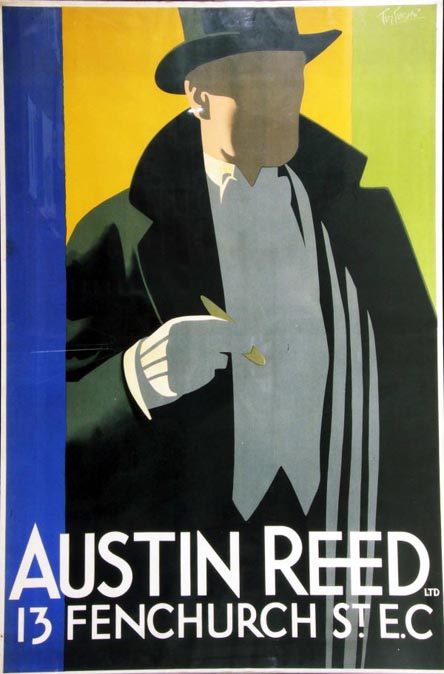
| AUSTIN REED'S 1930's | |
| GAS INDUSTRY C1937 single |
| EAST COAST JOYS WITH DETAILS |
| LNER | |
| CANADA |
| AUSTRALIA and INDIA | |
| BRITISH INDUSTRIES' FAIR |
| RED CROSS | |
| MAGAZINE COVERS |
| a selection OF ADVERTISING WORK |
| cover, Touring the Ancient World with a Camera, Holme and Gaunt 1932 |
| YORKSHIRE MOORS (Walking Sticks) | |
| HARROGATE (Tennis) | |
| BE EARLY (worm) | |
| THREE POSTERS |
articles
| Art and Industry October 1939 |
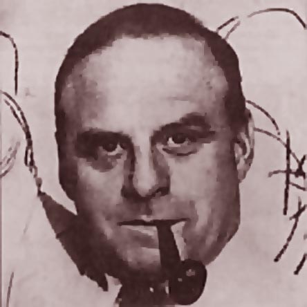
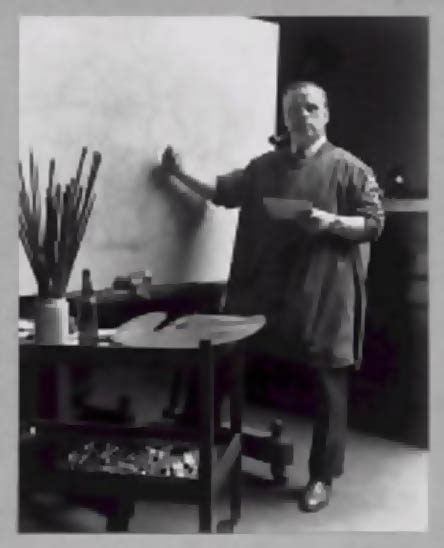
If I had my research time again I would spend it finding about what is meant/was meant by ‘Commercial Art” in the United Kingdom, its infrastructure, its development, its rules and regulations and opportunities. How did it look to the curriculum designers at the art schools, and how did the art schools prepare students for a career in the Graphic Arts. How did the main agencies come into being? What was the role of the Advertising Manager/ Art Director? How did the manufacturing or service company brief the agencies, and how were staff artists deployed in conjunction with freelance forces? What was the influence of Continental Europe in setting agendas and styles? Is there something that can be called British Commercial Art? What role did magazines play in the dissemination of information, techniques and attitudes? When were the major parent organisations of the profession set up and why? So many people who generated imagery of high visibility and aesthetic excellence were largely unsung and un-interviewed during their lifetime. Their archives were often junked and their art work fit only for Nostalgia based capital investment. I remember being unable to help Ernest Hamlyn Baker’s widow to place his archive, with full and detailed diaries of his practice. Cecil Bacon had contributed hours of interviews to Driver’s book on the Radio Times Illustrators, to find himself reduced to a few paltry mentions. His wife was disgusted on his behalf while he maintained a resigned and amused attitude. In the early days of the History of Advertising Trust, I was disconcerted to discover that memos and other documents were lovingly catalogued while many of the images deposited had been junked. I advised on a calender for the Trust of advertising by artists better known as ‘Fine’ artists, and remembered the fuss at the revelations, as if unseemly habits had been revealed. Tom Purvis died in 1959, well before my time, but surely in his career, his phenomenally varied output, the sheer glory of his public work on hoardings and in print, could have been taught us much about the making of twentieth century imagery. Tom Eckersley told me what an inspiration Purvis was in the Thirties to a young art student seeking clarity of shape and message, satisfying and effective letterforms and a native born artist who could match the Masters of Continental Europe, Hohlwein and Cassandre. Purvis was born in Bristol in 1888. His father was the marine artist T.G.Purvis. Tom went to Camberwell School of Art and then immediately served six years at the advertising firm of Mather and Crowther, then learning lithography at the Avenue Press. His first poster was for Dewar's Whisky, commissioned at the age of nineteen.Thus prepared he turned freelance. Accounts of him studying with Walter Sickert and Edward Degas (sic) can be discounted but their influence might very well have been a determinant. In the First World War he served with the Artists’ Rifles and also produced posters for the Red Cross. If his career began with his long association with the LNER a key image is his cover three years before, for Pan (Vol 1 no 11) a confident composition of rich tonal variety, utterly at odds with the formal style and subject matter to come, a sexuality that smouldered uncharacteristically, with the only nipple he ever placed in a composition. In 1923 Purvis started working for the LNER with William Teasdale and later Charles Dandridge as Advertising Manager. His contribution to their campaigns was so valued that Purvis was paid a retainer of about £450 per annum to be available. This is in contrast to employing an advertising agency with its usual committee structure. Purvis was particularly prized for his ability to understand the product, the service, and the possibilities. Between 1923 and 1934 he was responsible for over 100 posters, at the rate of one every two months, at a time when he was working for many other clients. I’d love to know the extent he relied on assistants, either in administration or preparing artwork. His other major client was the Gentleman’s outfitters, Austin Reed who opened a shop in Regents Street London in 1926. Through the advertising agency Pritchard Wood, Purvis was commissioned along with Kauffer and Fougasse to define the corporate sense of style. The consistency of his approach on all sizes of poster, their legibility and visual proposition did not result in repetition. Many of his compositions for the wide range of clients he had attracted suggest a dynamic use of photography as an aid to composition. In fact several of his photographs appeared in exhibitions with no hint of their original purpose. The exactitide of poses used in his posters suggests a sort of Rotascoping (Max Fleischer’s device to trace figures for use in animation). By 1935 he was sufficiently interested in the medium to lend his efforts and part of his name to the Purmayo Camera with A.J.Mayo In 1936 he was one of the first 36 Royal Designers of Industry and had been one of the founders of the Society of Industrial Designers for Industry in 1930. During the second world war he was an official artist attached to the Ministry of Supply returning from his studies pitted and black from drawing factory work. Factory Interior and Women Munitions Workers are in the collection of Glasgow Museums. Mention is made of paintings he made at the Rolls Royce factories. Where other recognised artists were entrusted with posters for morale, or for Health and Safety, there seems to have been no role for Purvis as a maker of public images. I have a strong feeling that his generation of Poster artists looked positively arthritic after the end of the War, associated with a pastoral charm, and high standards of drawing (Fred Taylor, etc) while the artists who set the agenda on the hoardings had developed their own English modernism, supported by distinguished exiles who had decided to work extensively in the UK. Purvis turned to portraiture as others before him had done, and being a devout Roman Catholic, to religious oil paintings. A decent selection of his Railway work is preserved at the Railway Museum in York, and examples of his work sellat auction for thousands. A sale of his work for Austin Reed’s gave us a privileged glimpse of the range of imagery for all aspects of advertising, tempering the experience of only seeing what are increasingly called ‘Masterworks’. . “ Onslows are pleased to announce the sale by auction of the Austin Reed collection of posters and original designs by the 1930's British designer Tom Purvis on view at the Design Centre, Chelsea Harbour, London SW10 on Tuesday 31st March 2009 between 2.00pm and 6.00pm and auctioned live on the internet through Liveauctioneers.com at our Dorset office on Thursday 2nd April at 3.00pm. The collection number some twenty designs were for many years displayed in the firm’s flagship store in London’s Regents Street. Saleroom estimates range from £700 for an original design to £5000 for the finest posters. They will be sold together with two hundred lots of other Vintage posters.” Much was achieved by John Hewitt’s book, The Commercial Art of Tom Purvis 32 pp. 23 illustrations, 12 in colour. The Department of History of Art and Design, The Manchester Metropolitan University, 1996, but was restricted by the brevity of the text. Purvis himself wrote ‘Plain Speaking to Poster Buyers – By Tom Purvis; in New Book’, Advertising World, October 1939, pp.23-24, and he contributed an introduction to Poster Progress, The Studio 1937. His war work is mentioned in Anonymous, ‘Tom Purvis is Painting in Scotland’, Advertiser’s Weekly, July 17 1941, p.58 His contemporary Bert Thomas wrote, "His posters were the finest that ever appeared on the hoardings. They were real posters, not just showcards enlarged as most posters were in those days. One could take them in at a glance while passing on a bus, which is the test of a good poster". The last words are his, " I loathe the word artist. Personally I am proud of being called a Master Craftsman."
|
![]()
back