


|
|
|
|
||||||||
|
|
|
|
||||||||
|
|
||||||||||
|
|
||||||||||
|
|
|
|
||||||||
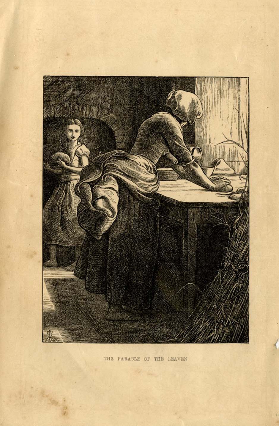
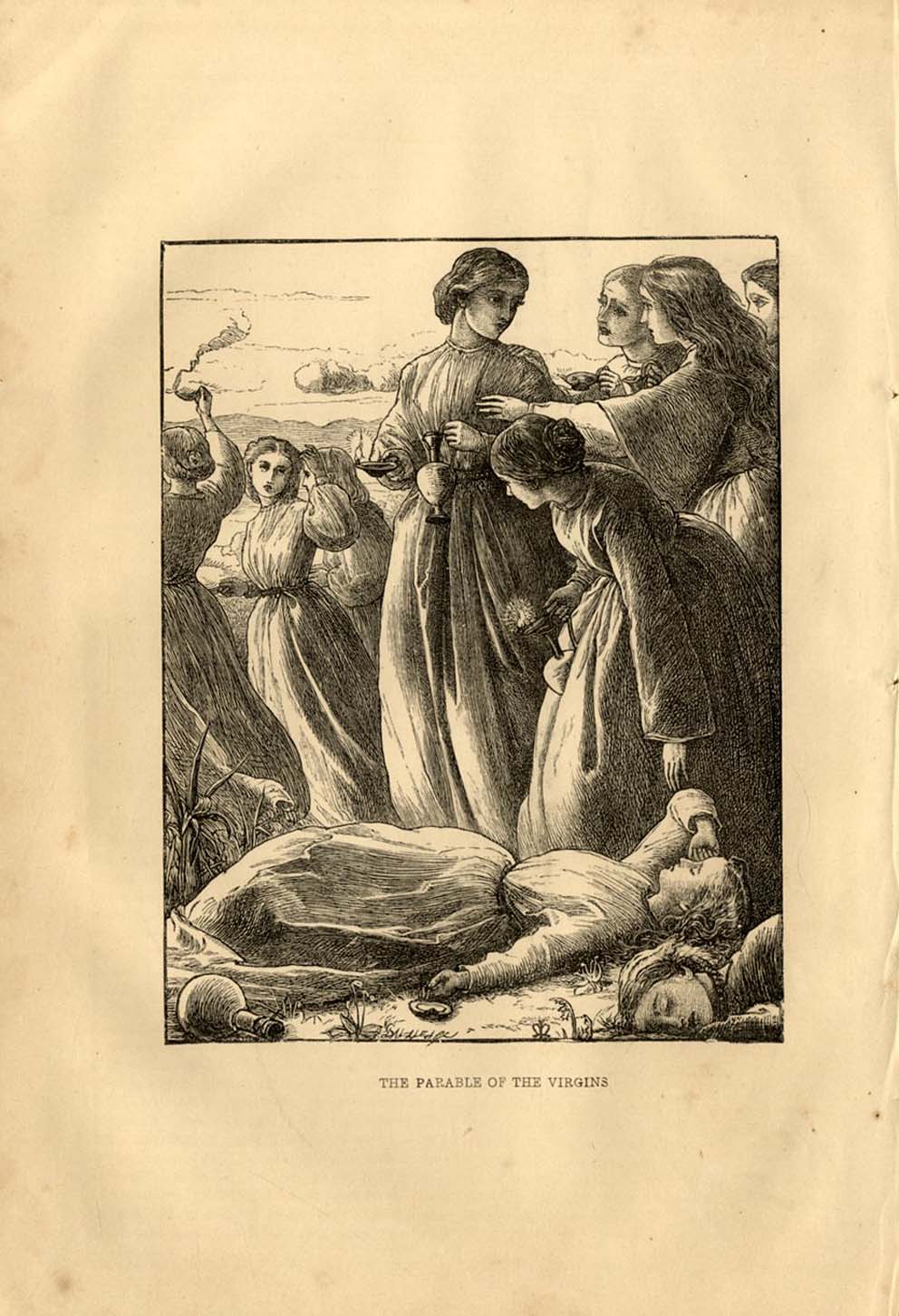
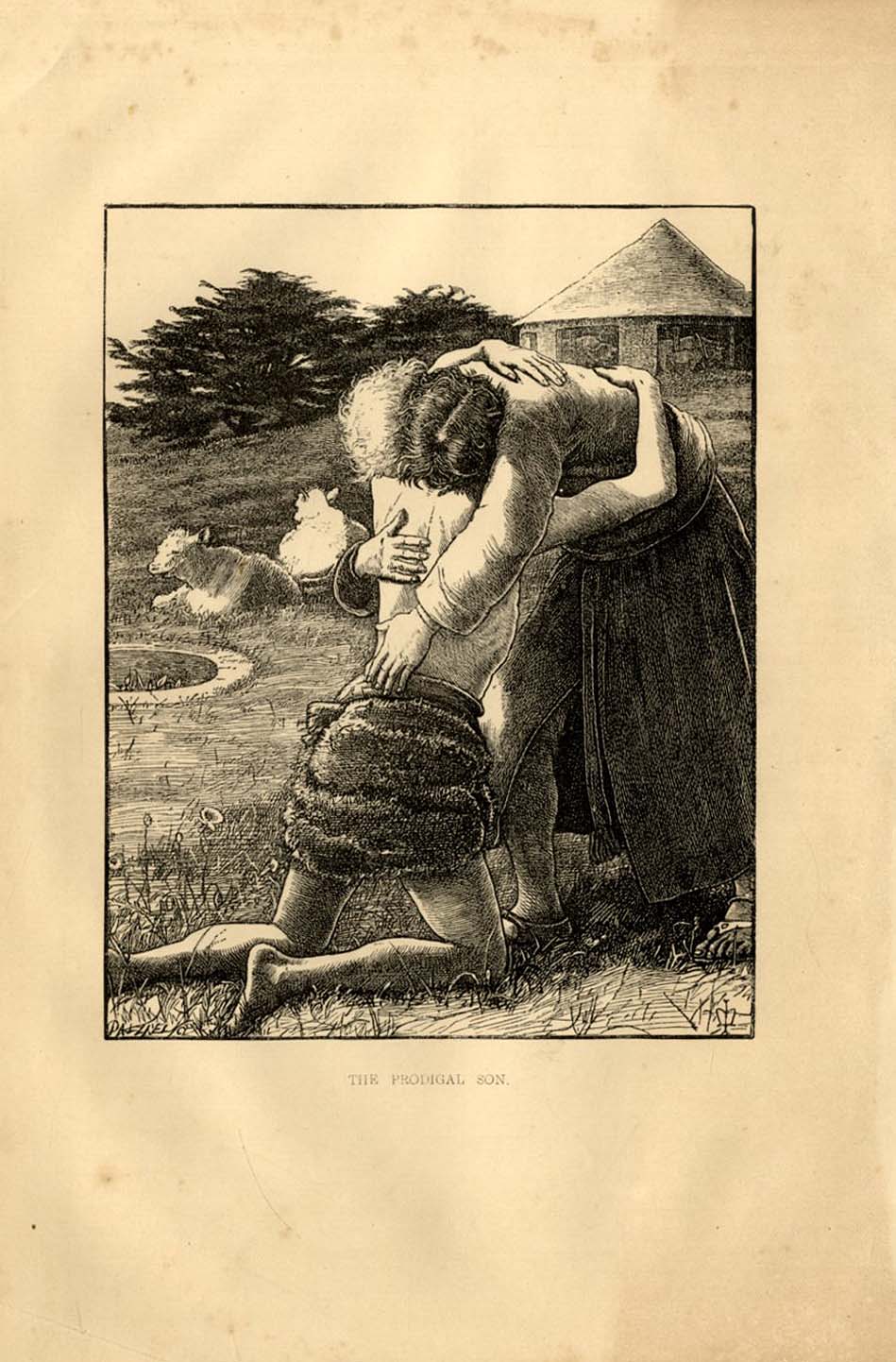
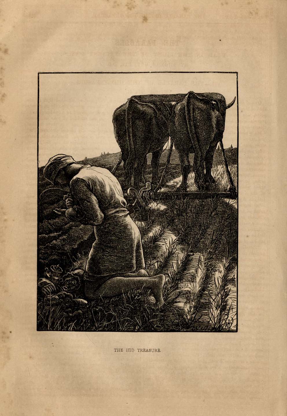
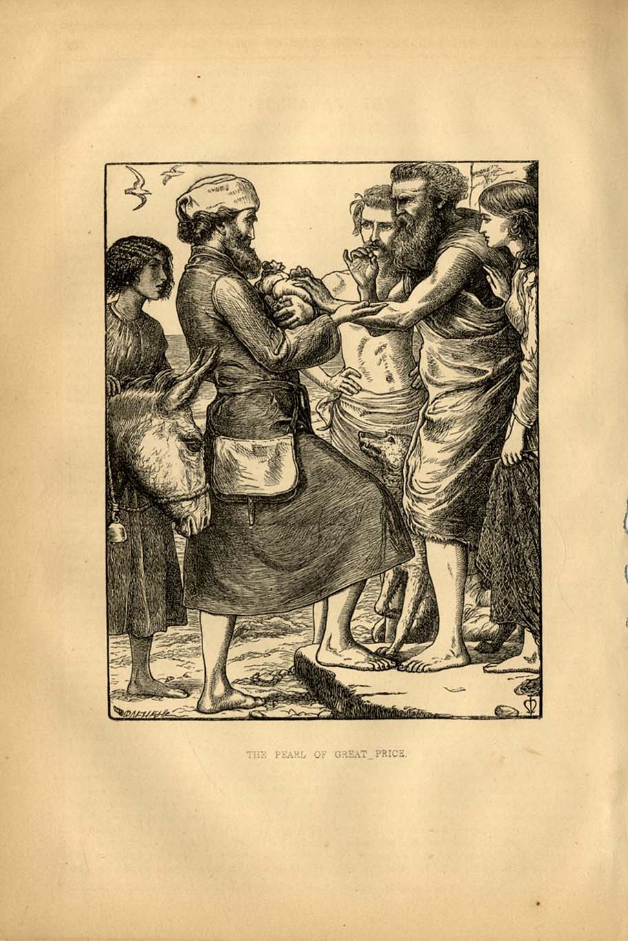
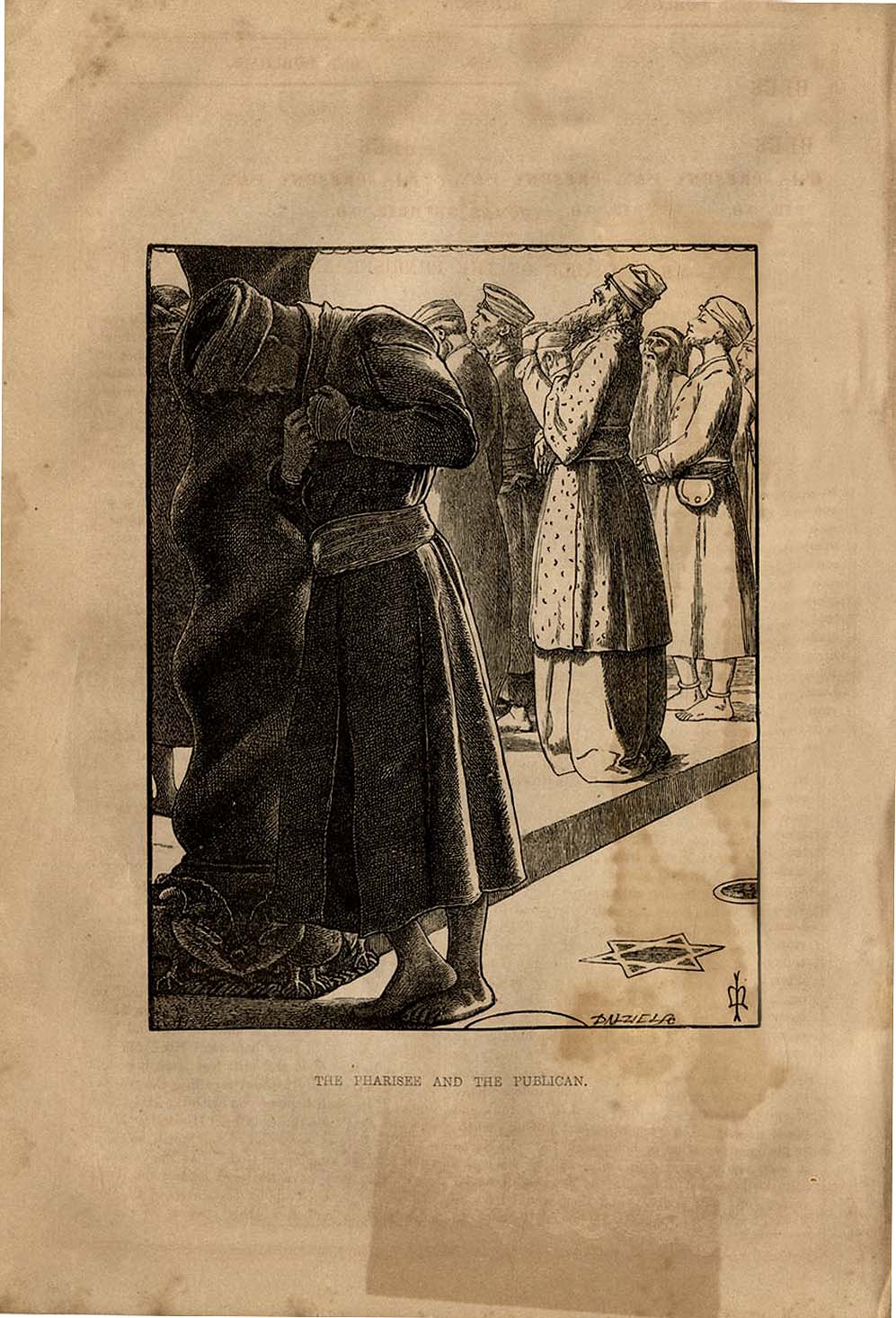
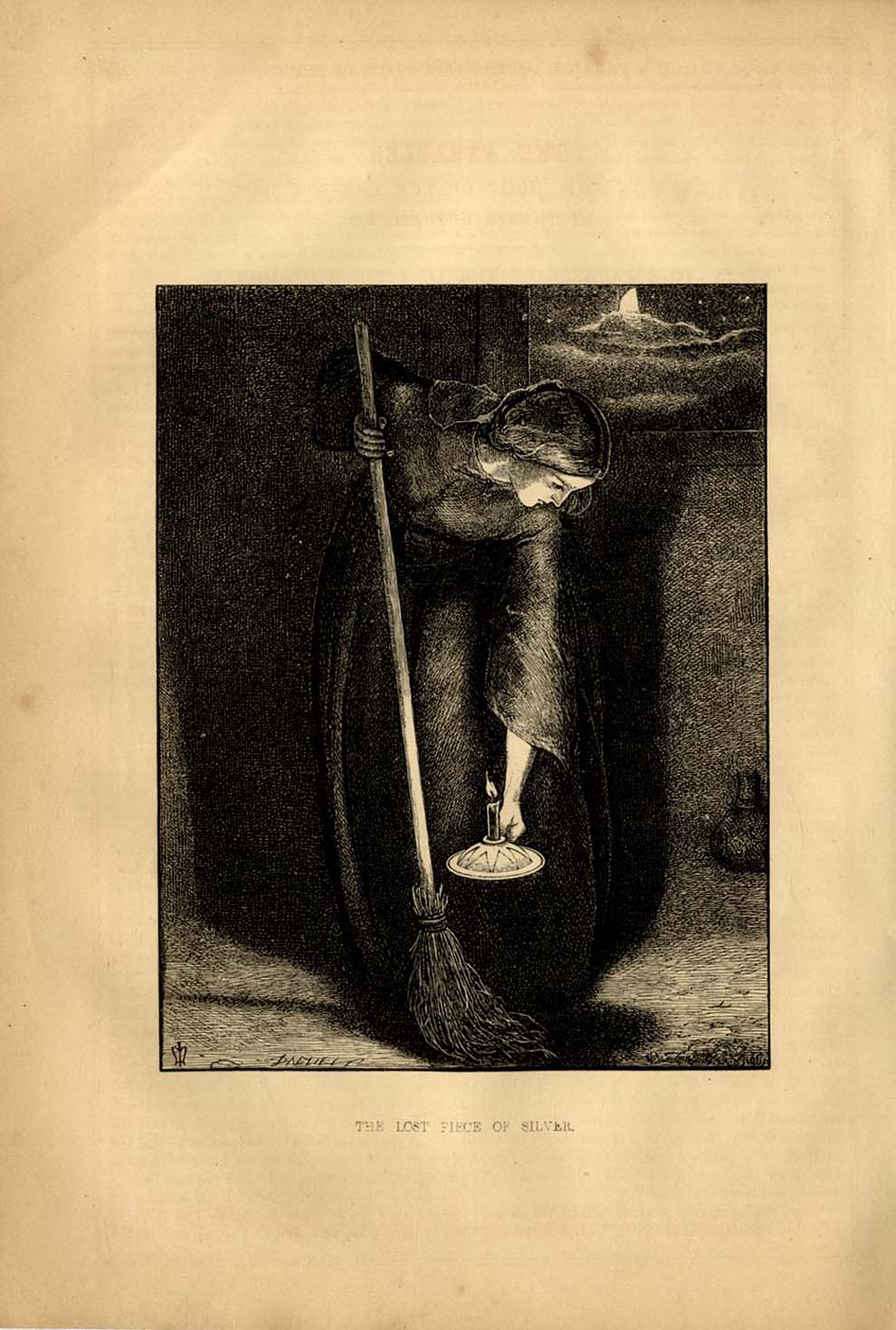
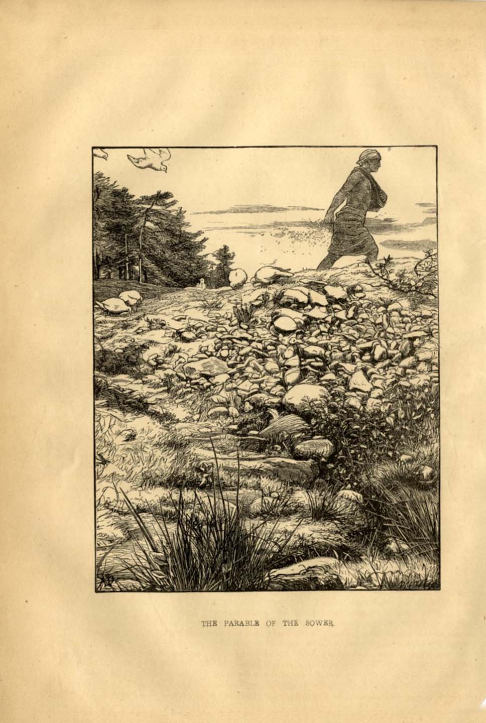
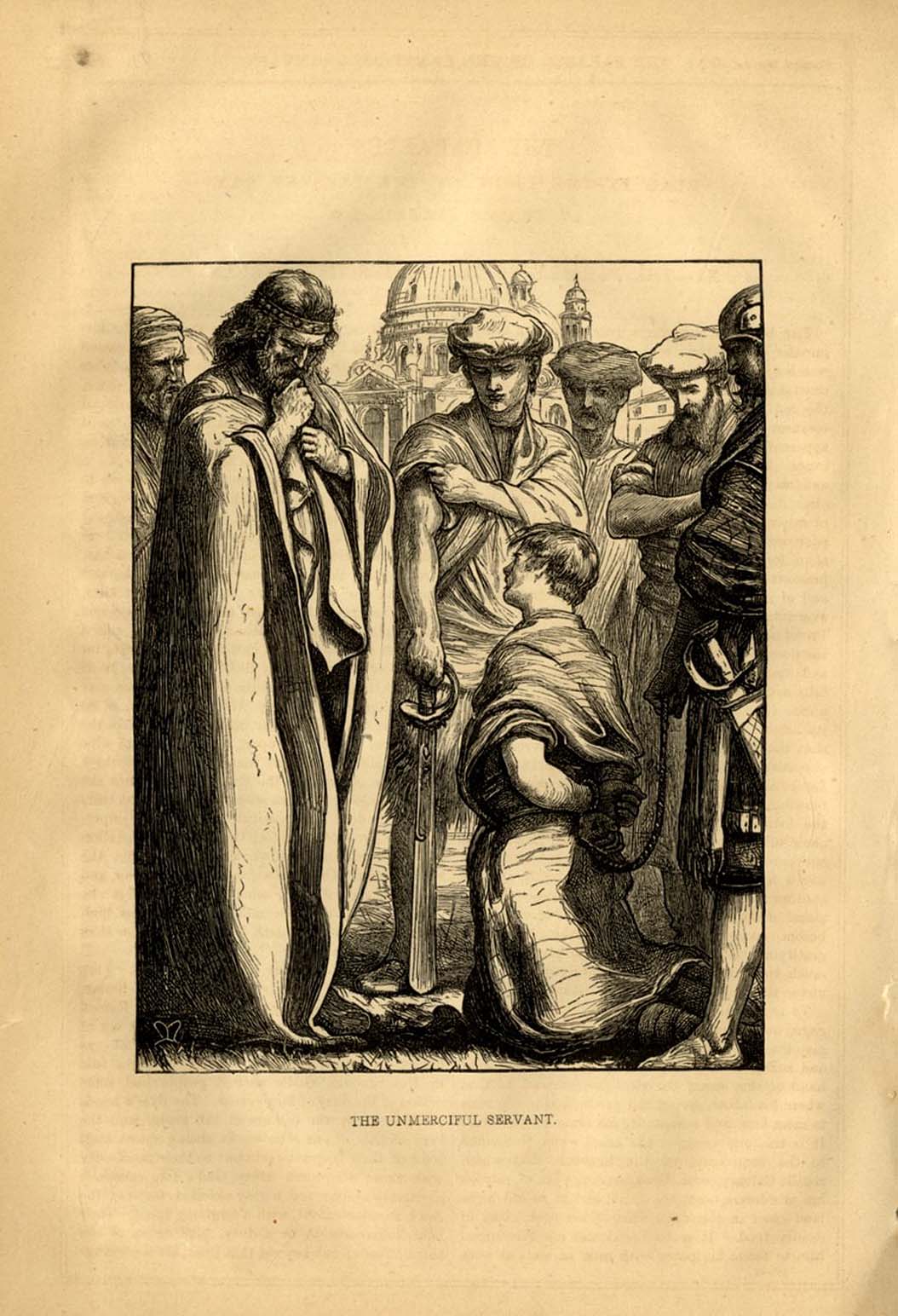
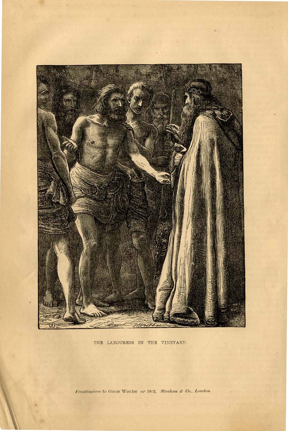
The twelve Parables are to be found in the monthly parts of the religious periodical Good Words for 1863 (each page 16 x 24 cms) and mark a high point in Millais' ability to translate his visual gifts into something of a sustained achievement. In the best of the designs he establishes a graphic simplicity unusual for the time, but instead of a stylised line style (Flaxman for instance), he aims for a sculptural density, almost to the point of stasis. The better designs show a reflective and a passive mood but he returns to old faults with the expressive and the gestural. The Prodigal Son succeeds in ways that much of his work in this period doesn't, a stylised and highly original device, with its hints at Giotto and the true Pre-Raphaelites, to mask the intensity of emotion by concealing the face in a highly stylised pose, yet retaining a sense of the real, particularly in the character of the landscape in the vicinity. The theme of intense emotion embedded in the composition without histrionics or extremes of physiognomy might be identified as a characteristic of much of English book and magazine illustration of the early 1860's. The last two of the Parables are the weakest of the set in terms of figure drawing and composition, hinting perhaps at a visual exhaustion at the end of the campaign. The previous year Millais had been given a foreground spot with monthly key illustrations to the serial Mistress and Maid (see menu) where the compositions and characterisations are much more pedestrian and subordinated to the text. The engraver did Millais a favour with the Parables, and only the poor quality of the paper stock stands as a inhibitant to their proper appreciation today.The publishers of Good Words chose a thicker paper for Millais's designs but even so the paper chosen is liable to heavy foxing and fading.Their recent commercial reproduction (2006) on bright white paper didn't help. |