![]()
ROSPA POSTERS AND LEONARD CUSDEN The Royal Society for the Prevention of Accidents In 1938 we went in for a competition that ROSPA was holding . We didn’t win a prize but we did get a call from the Design Director, Harry Winbolt, saying how much they had admired our design and that they liked it more than the winner. Would we like to work with them? Well, yes and we did some things for them just before the war. I joined up and then contacted them to do more work to help the war effort.
At the beginning of the war there was a lot of absenteeism when people got involved in accidents, falling own manholes, using faulty hammers when the head flies off, welding without goggles, a splinter in the eye. ROSPA had been asked by the different ministries to prepare campaign along these lines. I used to do them on leave. I’d get a 48
hour pass and go home with a particular problem in mind. I’d
have between three weeks to a month to come up with an answer. In the
evenings during my RAF time I’d turn it over in my mind. I’d
work on it at home and my wife would then deliver it. I’d then
be briefed again. I got a lot from it, to simplify a problem so that
it would be immediately understandable by the people involved. No question
of leaving it to the imagination. With certain posters you can,
but not with these which had to be immediate. Another thing I learnt from being in the Forces and working on posters was that it became a problem sending the designs by post to head office at Henlow in Bedfordshire. I designed these half or a quarter size. I learnt a lot from what happened when a design was enlarged. Certain textures would change, become more coarse. You were aware of this and could exploit it.
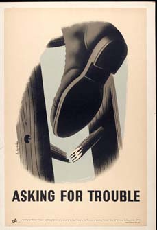
Sometimes when you get the proofs, the blues are all wrong. And I’d have to get them changed. But every now and then, the blue wasn’t what you wanted, but it worked. Looking at the posters Broken Rungs cause Broken Limbs and Asking for Trouble, both are directed to the same problem,. You’ve got a ladder with broken rungs and keep on using it, and then one day it collapses. Somehow you have to put that over, and represent Danger. These two posters solve the problems in different ways.
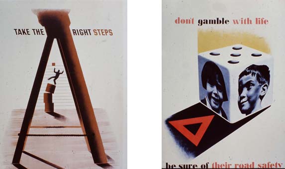
In Asking for Trouble, it’s a close up of the accident. It’s as if you had a camera, you were there at the time, you don’t need to see the result of it, you know what is going to happen. So that’s why I tried to use a photographic close-up of the actual accident. In the other poster Take the Right Steps, I tried to show the cause of the accident. There are two different versions 1941 and 1949. ROSPA The posters they produced before the War were not very good. The original manager hadn’t been there very long and wanted to change things. He had Leonard Cusden working with him who became a great friend of mine – a very fine poster designer himself in the 20’s and the 30’s, sometimes for the railways. He was a good draughtsman and a very nice man. I learnt a tremendous amount from him. He persuaded the printers to allow artists to use the split duct process which they would not do commercially as it wouldn’t pay. This meant you put two colours on the one plate provided they are applied separately. When they merge together they form as a gradation. If you don’t want them to merge, you leave a seven inches gap. See Report Defects. The merging help in the effects I was seeking. This was Cusden, always trying to get more colours. Cusden used me Schleger, Games,, a whole lot of people. I did more than the others. We worked well together. I didn’t have a lot to do at the time, it was a Godsend.
WORKING METHODS I would think the problem over on sentry duty. The back of the envelope approach is often marvelous. The answer doesn’t always come from steady working. Sometimes the solution is getting away from it all. In my case you couldn't design on duty, sleeping in a barracks. So the work had to be done at home on my day off. Half of it would be done one week, and finished off the second. It was easier for me because I had thought about it so much before I went home. It influenced my way of working after the War. There's not a happy image in the lot. Pain, damage and danger. This can actually kill you. The first aid people were very good and gave me the right information, the bandage and the eye patch for example. Some times I'd go for a briefing in London, but my wife lived at Henley on Thames in a garret with the children. I'd go from the base to Henley through Paddington and sometimes break the journey and call on Crusade. If I couldn't take the finished design, my wife could take it. I would change things when the solution wasn't right. But I have always hated changing it when it is nothing to do with the problem. If you work with someone you respect, you listen. Other people's work I was aware of Lewitt-Him and Schleger in particular. Pat Keeley did some good work.
Were you aware of the Fougasse posters at this time? I didn't mind them. He was a very well known man, a personality. He made the statement, of Hitler sitting behind you. It couldn't be expressed dramatically. There was some indifferent poster work during the wartime period - GPO, ROSPA and the Ministry of Food for instance. George Morris' Poster, Eyes cannot be Replaced, is wonderful.
Did you think of using cartoons and humour? I didn't. It wasn't appropriate. I prefer dramatic solutions. I'd love to have something like that on the go again now. You feel it's very worthwhile. It's not selling toothpaste. Later work like this was the Yugoslavian Peace Poster and the World Wild Life campaigns that really affect the future of mankind. Can Posters really persuade? Yes they can. That's why they shouldn't be funny. You used a photograph in the RAF enlistment poster. Why so? They had a photo set-up at Henlow. I thought it would be more convincing in photographic form. The reason was that in this case, they wanted to show a young man and I found this photograph that was so much better than a drawing. For Don't Gamble with Life, (above) I had a cube made up and got George Morris to do photographs for me and then I had the photographs stuck onto the sides and photographed again, careful to get the right perspective. Could you invent your own copy? Yes. Often. That was my line Don't Gamble with Life. But ROSPA would brief me and give me the copy. Then they would always listen to suggestions. Suspended Loads. They were so short of paper they thought they would have two posters printed on one double crown, and then divide it. Talk me through getting texture and line on the ROSPA posters. They are all done with stencils with oil brushes stippling with gouache. I would draw on cartridge paper and then cut a stencil from that. You'd cut say the sole of a shoe with a different stencil. It gave me a sort of freedom. With stencils you didn't have to worry about the edge but could think about how to vary the textures. I had worked like this before the War with Lombers. I knew Cassandre used stencils. Kauffer did with Elsie and her Child. Textures vary according to the brush. You can also wash colours on like with the ROSPA posters. Up to the 60's I worked in gouache, and after about 1965 mainly in cut paper. How do you feel about the ROSPA posters now? Oh I like them. They have survived well. I regard them as my best period. They have always been respected.
|


![]()