


|
|
|
|
||||||||||||||||||||||
|
|
|
|
|
|||||||||||||||||||||
|
|
|
|
||||||||||||||||||||||
|
|
|
|
||||||||||||||||||||||
|
|
|
|||||||||||||||||||||||
|
|
|
|||||||||||||||||||||||
|
|
|
|
|
|||||||||||||||||||||
|
|
|
|
|
|||||||||||||||||||||
|
|
|
|||||||||||||||||||||||
|
|||||||||||||||||||||||||
SINGLES
|
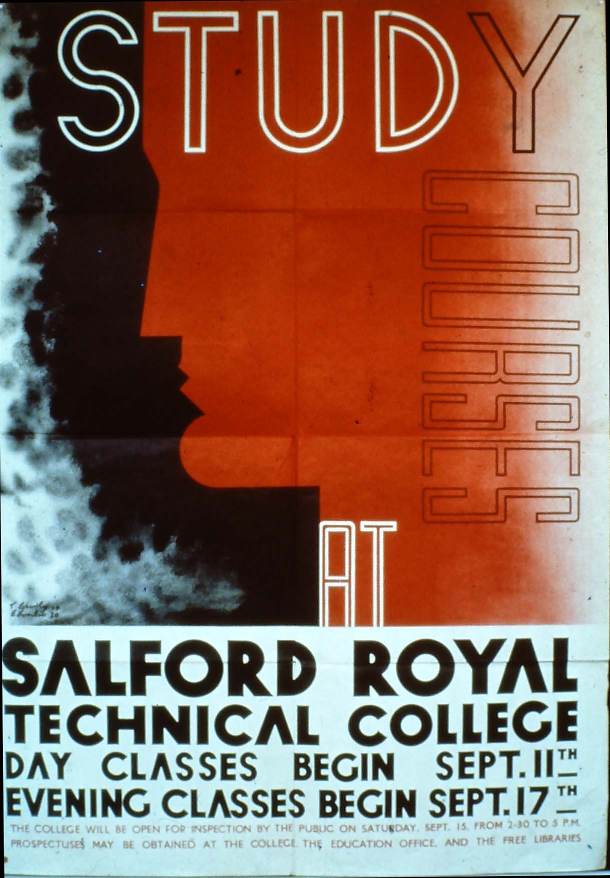
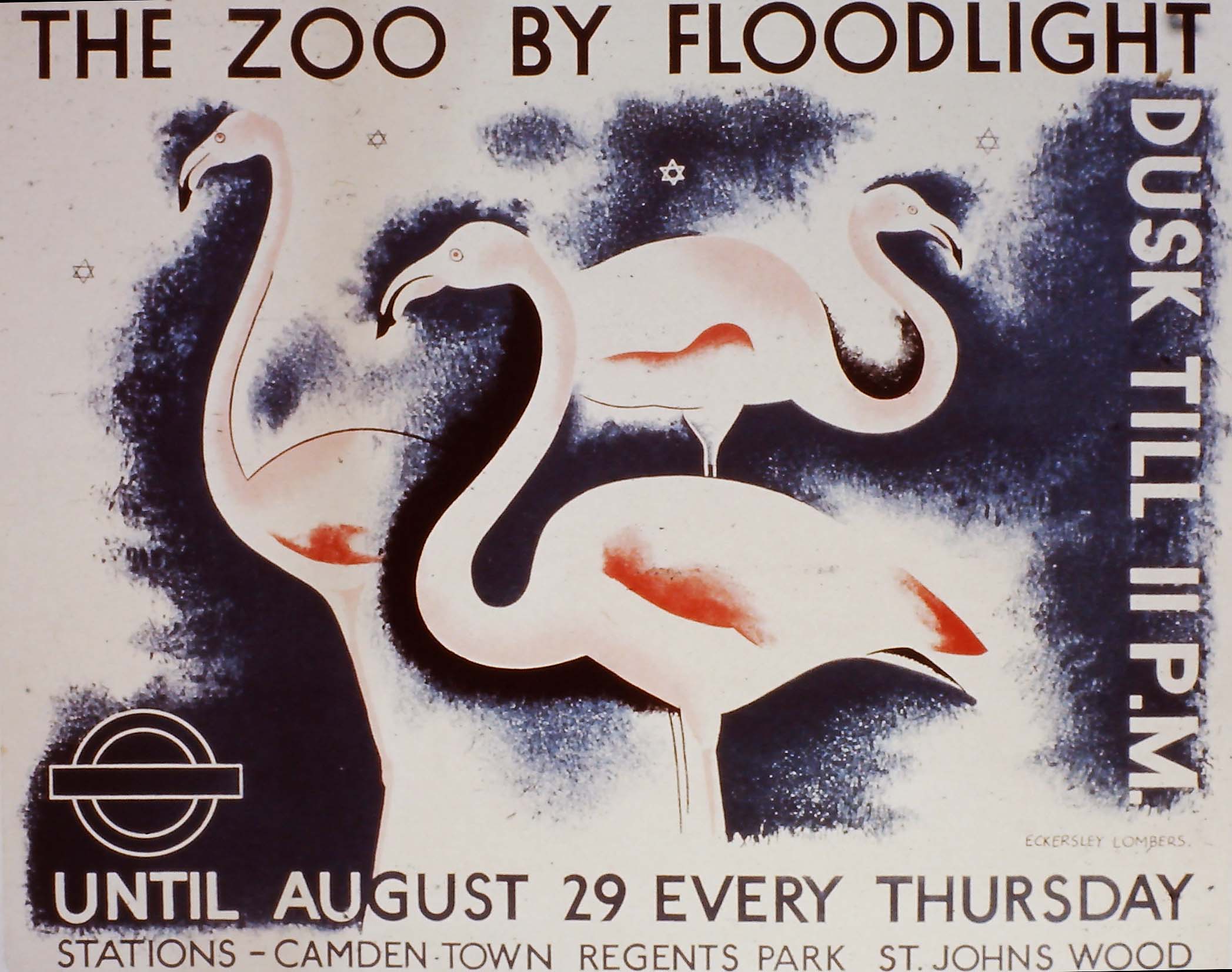
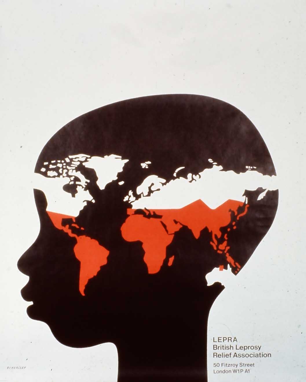
TOM ECKERSLEY (1917 – 1997), a personal memoir
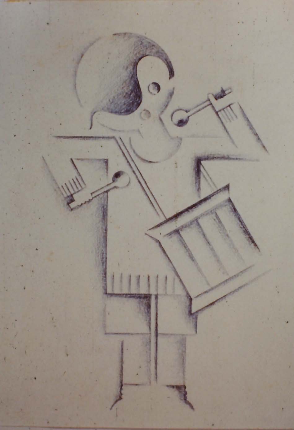
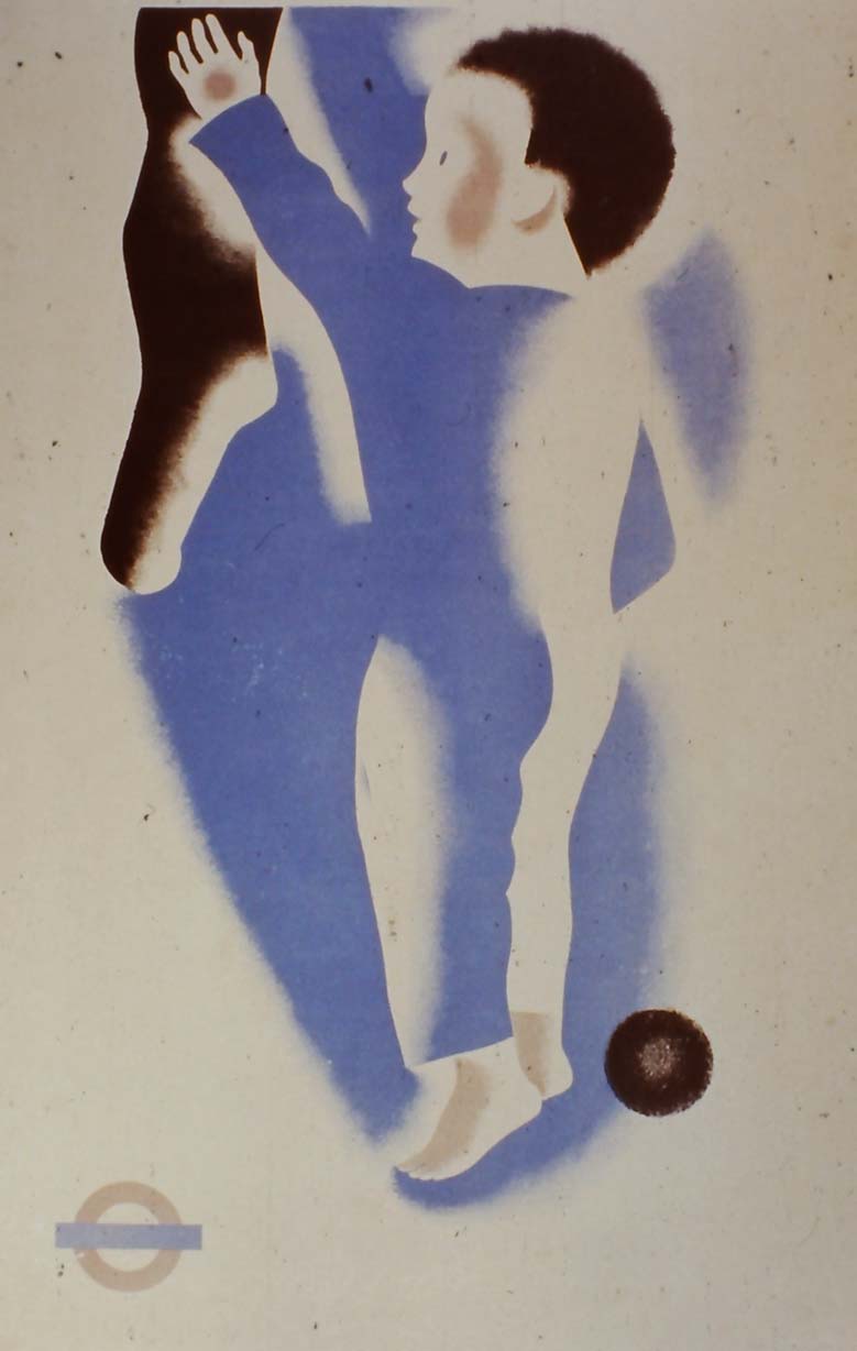
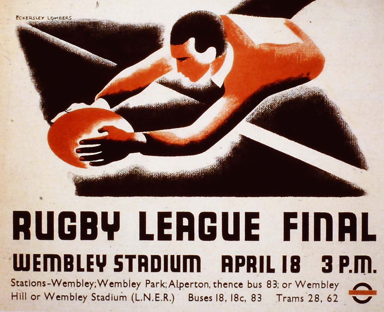
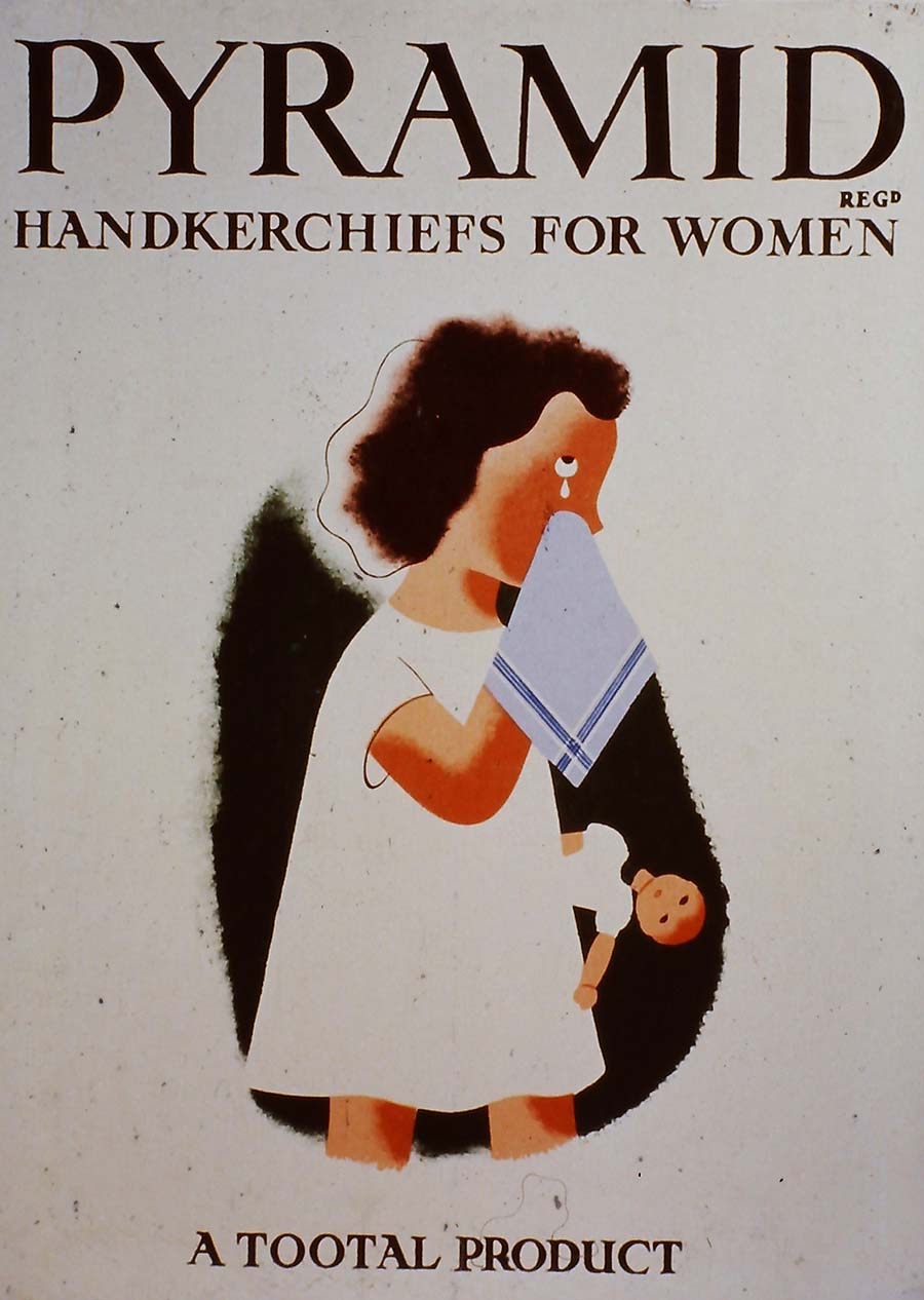
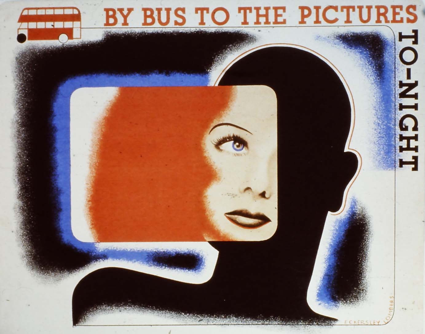
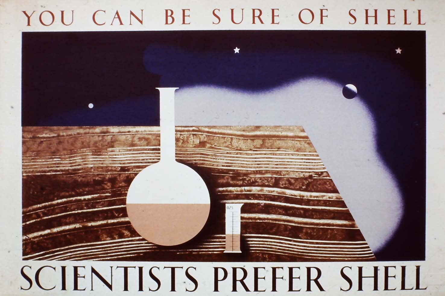
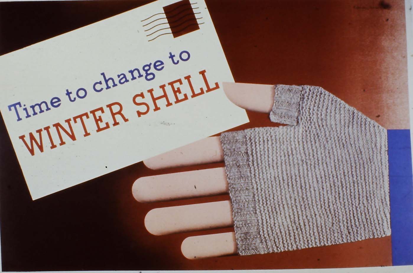
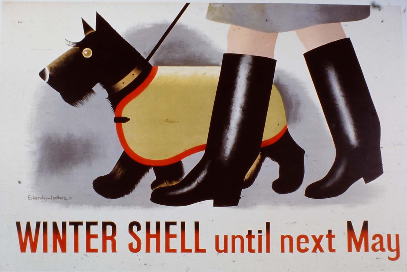
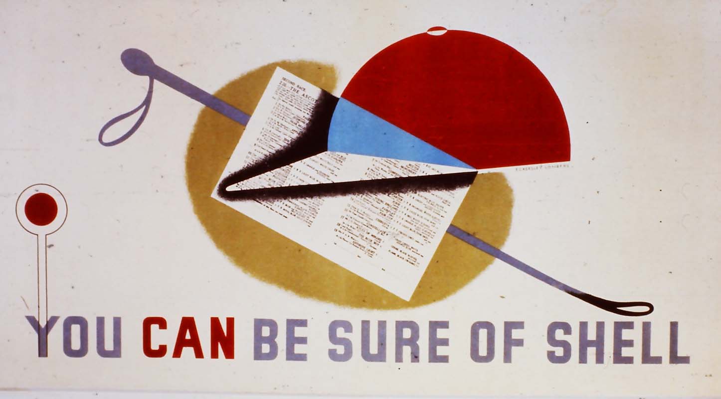
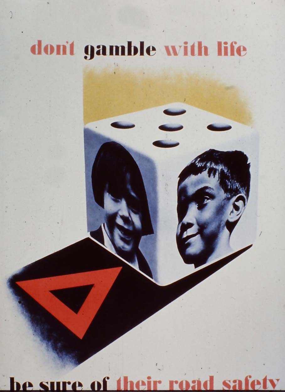
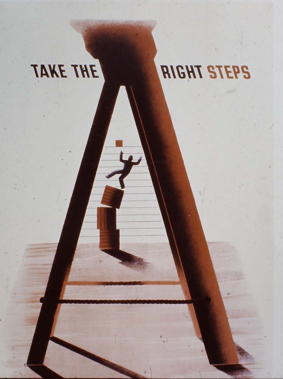
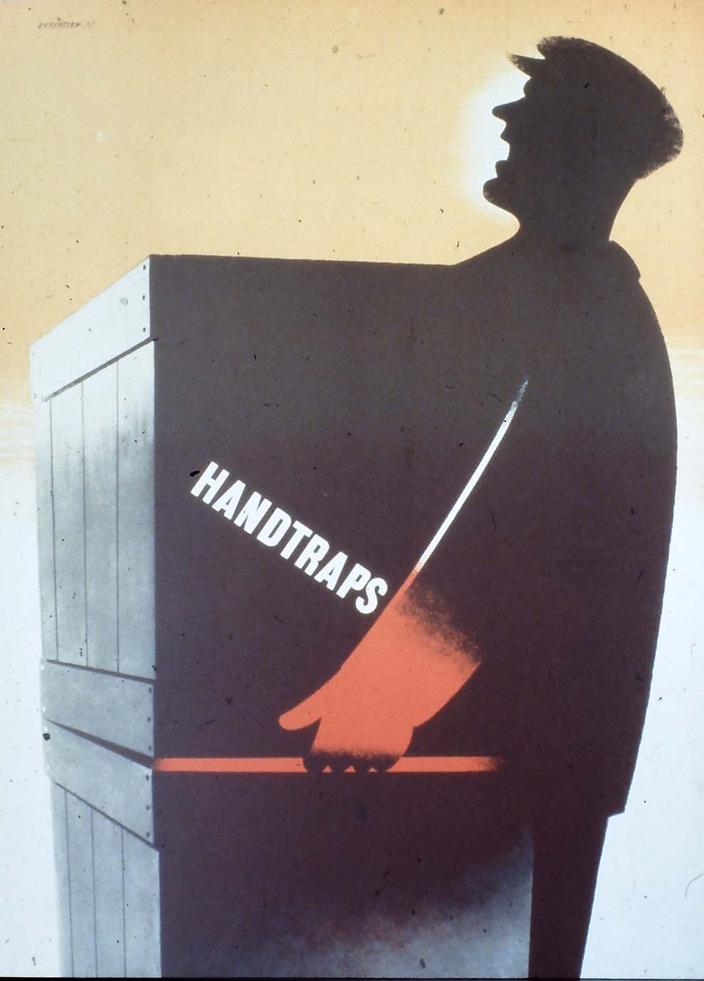
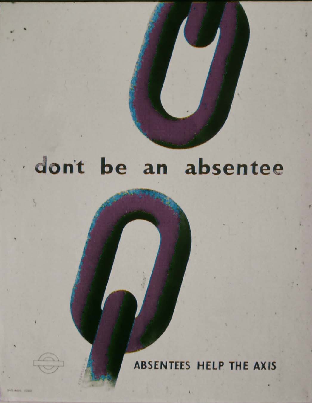
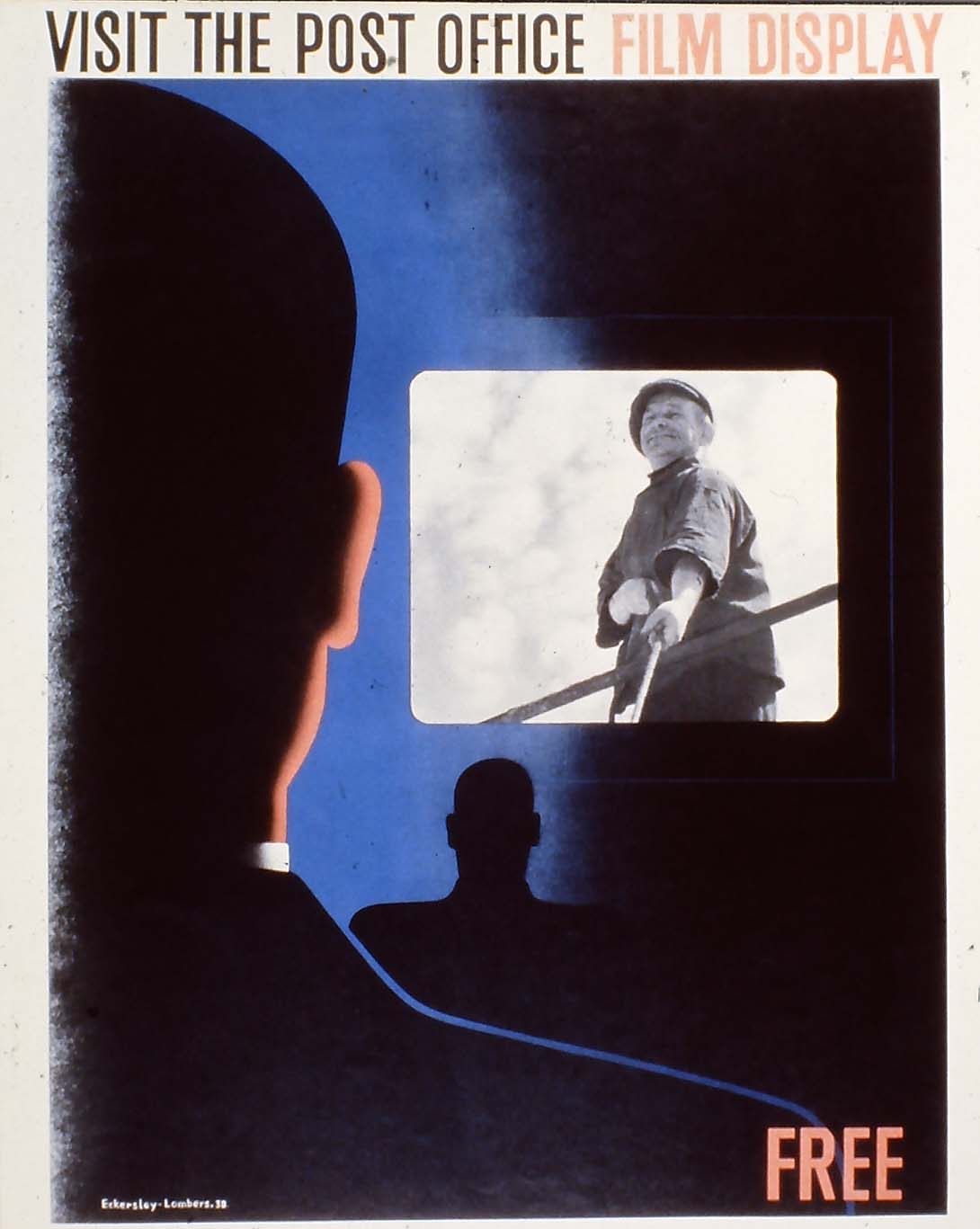
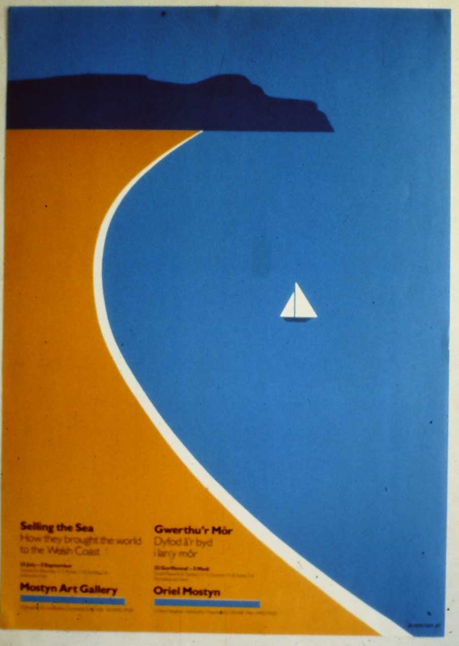
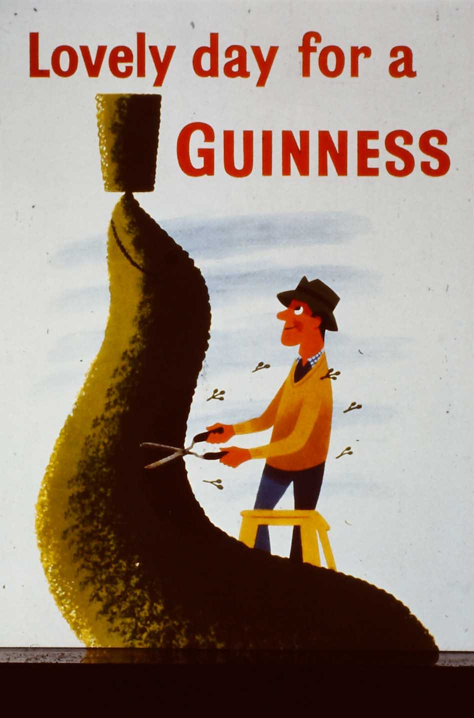
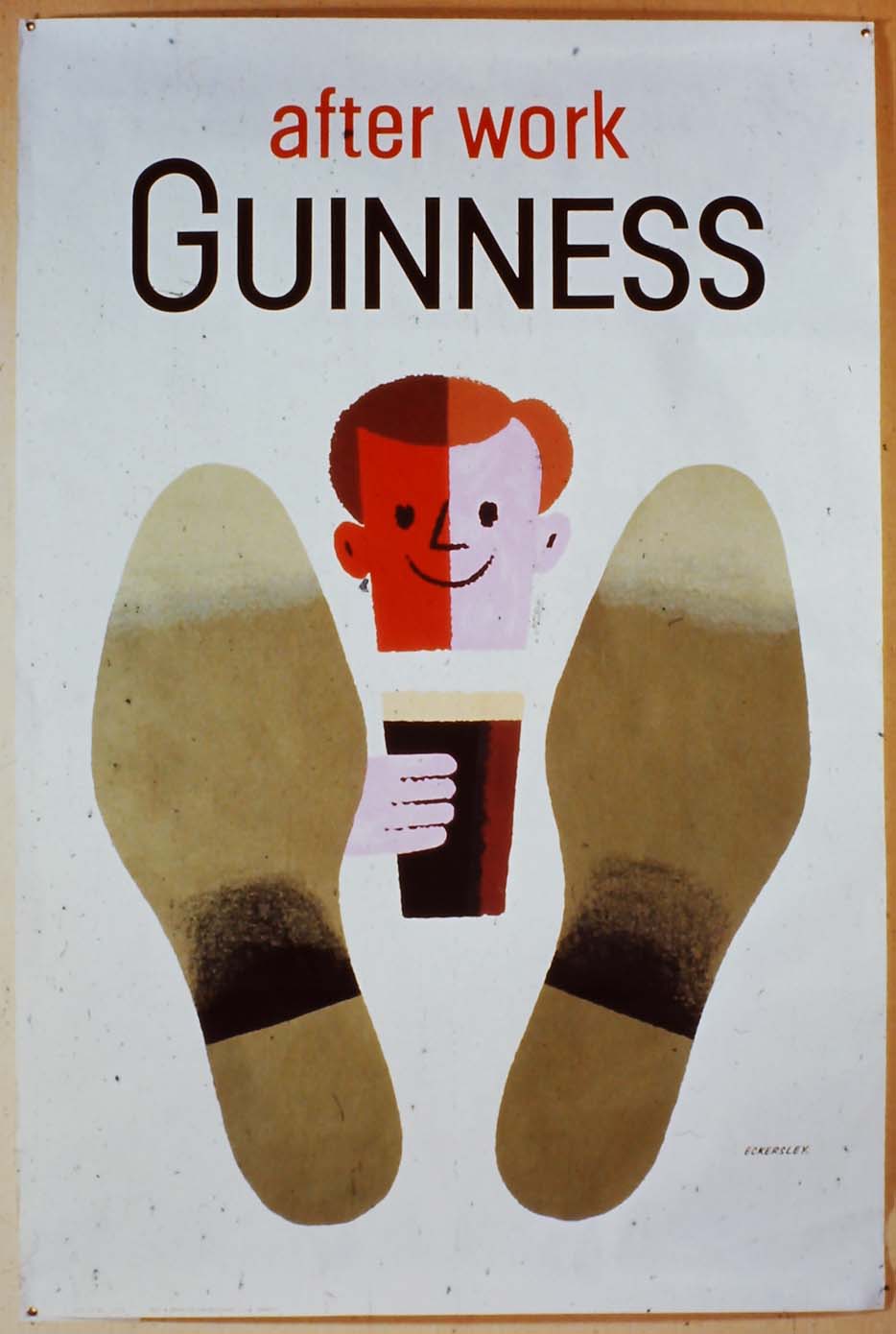
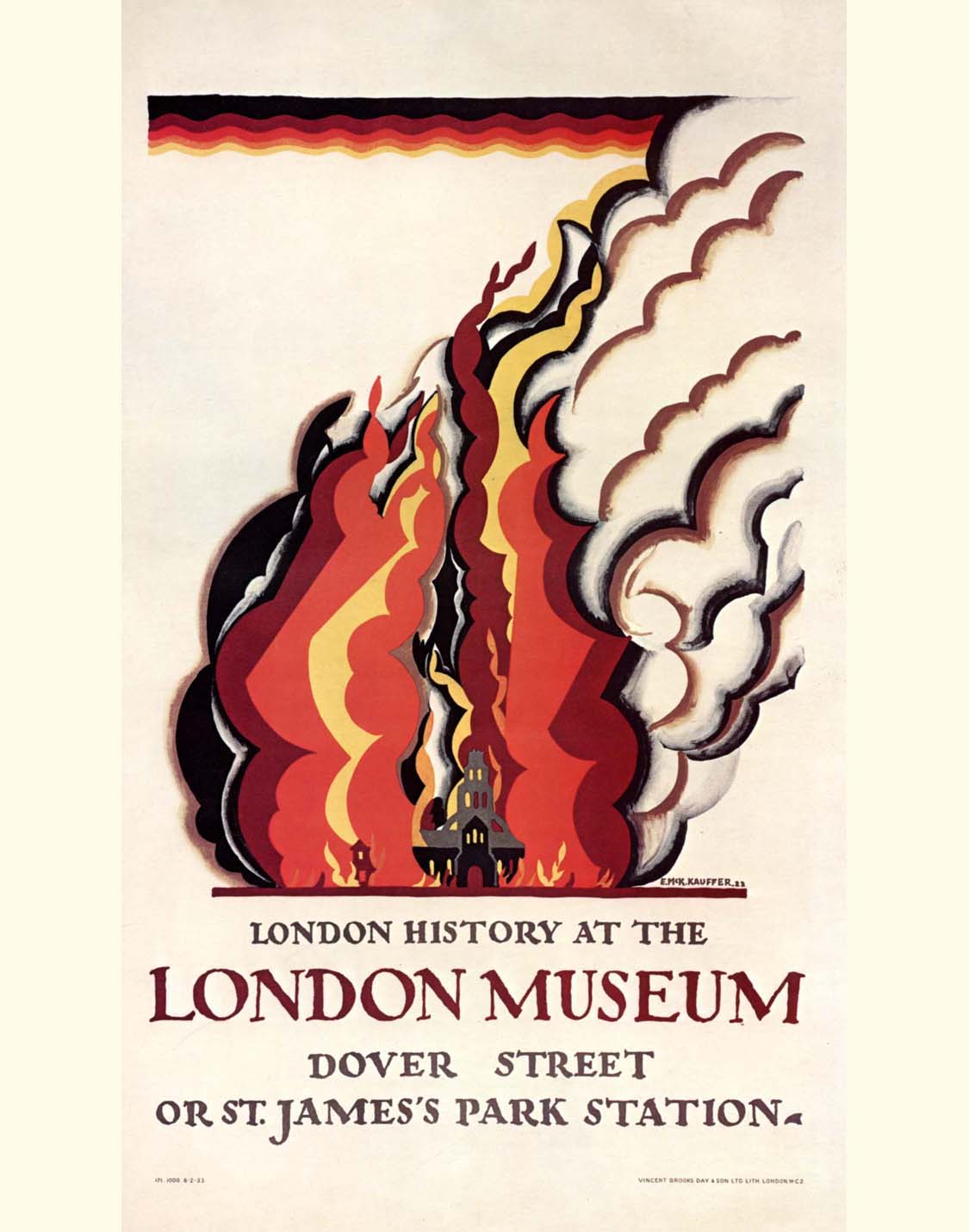
Tom came up to teach a project at the Norwich School of Art, jointly with his one-time student David King, a pairing imaginatively initiated by Head of School, Andy Vargo. During the project Tom stayed with us at Harvey Lane and we got to like each other, talking much about the design process. He enjoyed my library too . “Tell you what,” he said in his quiet way, “Come to the studio. Look at the work. We’ll talk more.” Between us we photographed his life’s work, from which I would try and assemble a book. I photographed the contents of his studio for reference. I recorded a sequence of interviews on sound tape. “Do you think there’s a book in all this?” he proposed modestly, a question that needed no answer but much careful thought. His first floor London flat was of course spotlessly clean and tidy. Everything was in its right place before my arrival each month. Our lunch lay carefully prepared on one side. We talked, lunched, then talked some more. The first opportunity I had to write something was for St.James’ Press, Contemporary Masterworks edited by Colin Naylor (published 1991) where each entry concentrated on one key image, be it Graphic Design, Photography or an exhibited piece. Aaron Scharf put me in the frame. I criticised the choice of individual entries very early for its lack of representative women. Being a pal of Aaron gave me a certain confidence. The editorial board agreed. Having thrown my weight around I promised articles on George Hardie (Trickett and Webb Calendar), Walter Allner (FORTUNE cover) and Tom’s 1975 poster, Help Lepra fight Leprosy. It was all too easy to select a celebrated Eckersley, such as his ROSPA posters, his London Transport masterpieces or Austin Reed advertisements. One morning he told me how the basic concept for the Lepra poster came about when papers were blown off his desk and suggested the strong breakthrough idea when a head could be read through a world map. The charm of chance made a startling exception to his usual methods of working. Writing about the Lepra poster was part of a joint speculation on what made him the way he was. He was remarkably candid about his strengths and his weaknesses. I wasn’t used to writing about the reductive process in design, for that seemed to be the key. Around the time I visited him in 1987 I was involved in organising a show of railway posters at the Llandudno Museum with Jeremy Theophilus, entitled “ Selling the Sea, How they brought the World to the Welsh Coast”. Jeremy commissioned a poster from Tom who had taken his holidays there as a kid and had the contours of the land fiercely in his memory, the twin promontories, The Great Orme and the Little Orme.. Thus I was able to watch how the basic composition evolved, or rather was cut back to the bare and vital essentials of Ormishness. In the process of watching I saw how difficult it was to write a description of the process of making each image. Tom was methodical in storing preparatory work for each project but I didn’t see evidence in sketchbooks of his thought processes. Drawing seemed to play no part although I could be mistaken. I’d never have let a student of mine rely so much on memory. A more demonstrative man might have said, how the successful design just screams Llandudno and summer holidays. Tom just nodded with a quiet satisfaction that the idea was strong and carried out to his satisfaction. In the end I felt a complete heel. Gordon Fraser were politely enthusiastic but I had no influential friends to urge our case, and Tom was rather diffident in himself pursuing a publisher. I wrote a considerable amount about his work, his relationship with the commissioning body, the stylistic influences he found meaningful and how he approached assimilation. Looking through my notes I found his own account of his early years most fascinating - taken by his Mum for an interview at Salford with no idea of what an Art School offered. So many assumptions are made as to the curriculum and syllabus of the British Art School, as if it were able to galvanise, or at least creatively charge the willing and the unwilling. Tom found out he had drifted into something that suited him and had a driving need to find out. He remembered no effective Library but rather a long wooden table upon which copies of the current European Art Magazines were left for students to browse. There was no organised teaching of typography. Much of what he developed was intuitive or copied from the magazines –The Studio, Gebrauchsgraphik etc. The Graphic Design History Industry creates a whole range of possible conceptual underpinning for advertising, typography, illustration and marketing in the period before 1939, reflecting of course the individual philosophical skills of the historian. Little is said, understandably of the hit and miss, the fortuitous encounter on the Blundering-In principle. It seems a constant factor in my encounters with creative artists’ development is the importance of the whimsical, the perverse, the wilful during education. Surrealism, Dada, Purism and Modernism came to him in sacks into which he dipped a curious finger but without a method. Rather than absorb at the source, his version of Surrealism came filtered through Paul Nash. Leger seemed a source of inspiration but not as much as emerged from Cassandre’s posters, and particularly those of McKnight Kauffer. Tom was willing to confess how much he had achieved through misunderstandings and secondary sources. Tom had clearly found his metier at Salford (1930-1934) , but I had the feeling it could have been anywhere. Leaving art school he formed a partnership with a fellow student Eric Lombers and went straight to London He launched himself forward in a determined, almost demure way into the service of the top agencies of the day, for advertisers such as Shell Petrol Products , London Transport, Austin-Reed and the BBC. At the start of the War he was called up into the R.A.F. moved early from the cartographic department. He recalled doing his share on sentry duty, thinking out ideas for posters. In his spare time he offered his visualising talents to the Royal Society of the Prevention of Accidents resulting in a series of concise and immediate propositions about Health and Safety at work, despite a shortage of paper and inks. Such was the peripheral reputation he established he was subsequently moved to the Air Ministry’s Publicity Unit where his graphic heart wasn’t in appeals to the Ideal, and attempts to boost military morale. Interesting here his revulsion for rhetoric, his preference for work that helped people at work. I wondered whether he had been been this quiet and kindly all his life. It seemed so from those he knew him during the early period, in his graphic career after the War, and particularly those who had worked and taught with him at the London College of Printing. He had a reputation for putting student welfare before his own contractual working hours. He really had been that considerate and reflective all his life. On several occasions I had met Tom’s good friend Abram Games who was clearly devoted to him. Games was a prickly and arrogant man, well aware of his own international reputation. I shall never forget his scornful remarks at a lecture he gave to staff and students at the Norwich School of Art, that “those who do design, and those who don’t teach.” Cheeky sod, I thought. You’d have never said that with Tom in the audience. Games was so full of himself that he never checked through his lecture patter for clichés, or for aggressive opinions long since rendered obsolescent. He bristled constantly, almost as if wishing his own work had that sense of attack. I remembered his brandishing a biro aloft to make a hackneyed point. His Deckchair enlisted in the service of the jersey Tourist Board was described in terms more appropriate to Russian Agitprop. I began to let my antipathy affect my appreciation of his work, until I remembered the bitterness and rage of an East End Jewish lad of Latvian stock who had seen awful things. As I advanced further into Tom’s work, I learnt much about his working methods about which he would have no mysteries. His early posters with modulated paint in planes using cut stencils, almost pochoir fashion, almost like the use of friskets in airbrushing. Later he developed a cut paper process where the outlines were drawn, revised then cut with a scalpel. The choice of colours was constant and the outlines fixed almost mechanically. It began to dawn on me that a convincing monograph was going to be difficult to write, that the text would in itself be honed down to the minimum for maximum meaning. Not me, thought I. But there were texts that easily supplement my own critique, Tom’s Studio How to do it book on Poster Design, articles in Graphis magazine and the like. I wrote to Paul Rand and Bradley Thompson who sent glowing testimonials about Tom’s character and his impact on post-war British graphic design. But where was the man in all this. Even in moments of candour at his own failure with certain commissions, when I tried to broach any link between his generation of ideas and his life in the real world, he politely swerved the approach. The key I believed was a permanent sense of guilt at leaving his first wife Daisy for the painter Mary Kessel (1914-1978) who he met at the LCP and married in 1966. I knew Mary only though her illustrations to A Sportsman’s Notebook by Turgenev, The Book Society 1959. A friend who knew Mary said that when she met Tom, she knew exactly what she wanted, and walked off with him under her arm, “like an umbrella”. A cruel analogy but it helped to account for his absolute refusal to stand anywhere else but behind his posters. It was clear how much Tom missed Mary, taking every opportunity to include her in the aesthetic calculations behind his designs Tom was often credited with single-handedly rejuvenating British Graphic Design after the War. This has unfortunately been said of many artists over the years. It is almost like getting the equivalent of a gold watch on retirement. The more I thought I realised I didn’t know what that meant. You wouldn’t still make the claim after systematically reading GRAPHIS magazine before 1955, which demonstrates the enduring sense of whimsy and class conscious piffle around, even in the Halls of the Avant-Garde. He produced one GRAPHIS cover (not his best) and featured from time to time in editorial matter. Rather than seek some grandiose philosophical achievement or fundamental flaw, it was instructive to ask him to discuss how and why one design was successful than another. What were the stages from a notable success through to a failure, through effective, less effective when made, or which had become ineffective. Tom was generally agreed to be a Gentleman, an English Gentleman if there ever was one, marking care and consideration, tact and humanity rather than tweeds and shooting stick. It was impossible to ask him where anything had gone wrong in his life. Whether he was ever fretful about being a freelance; whether making posters at the LCP was not a fusion of education and practice, but a way of keeping sane in the management of education; whether he had been too long at the LCP; whether he could have done more book illustration, etc etc. The most remarkable day I spent with him was when he looked critically at his post-war work before the big stylised colour posters with cut paper. “I look back and my figures, well, they are all smiling, I can’t bear it now. But we had to make posters then to cheer people up. Always smiling.” He allowed a puff of irritation at himself. For me it was instructive to see how a National School of the Surgically created grin pervaded visualisation during the Age of Austerity – Games, Schleger, Henrion, Eckersley, Bruce Angrave, Hanna, Lewitt-Him - the list goes on – mouths in a grin constructed not from a drawing but from a shared ellipse signifying joy and satisfaction, usually at the product. The second irritation he externalised later in the year was more heartfelt and less reflective. He wouldn’t talk much in the morning and then revealed that he’d been approached by the advertising agency J.Walter Thompson to produce a poster for some product they were trying to shift. His first design had been turned down because, “It was not Eckersley enough…” He bristled. “What d’ya make of that? Eh?” he snorted and we had another cup of tea. I should add for those who never met him that he had retained a distinct Lancashire accent that living in London never expunged. There is a third irritation on the Golden Plain of Eckersley. Many artists with whom I broached the subject are often chided by the impertinent that they no longer did the sort of work with which they were most associated in the public mind. At a private view of a retrospective show of Eckersley posters at a provincial art school Tom was buttonholed by the Principal. Drawing him aside, it was made clear that it was a shame that Tom didn’t do those early posters any more. The Principal’s critical momentum ran out because the cheap wine made him incapable of articulating what he found barren in Tom’s recent work. This was matched exactly when I interviewed Humphrey Spender who had his patter for Mass Observation ready at the Station. Much more interesting was his recent work photographing printed circuits stood up against his Photographic Landscape Lollipops for Jarrolds’ calendars. He let out a whoop of joy to be able to talk about the present and not the past. The photographer Nigel Henderson avoided interviews with critics and historians because the event made him feel as if he were dead. Tom died in 1997 and left his archive to the LCP, (now the London College of Communication, and named occasionally something else) his alma mater and harbour of refuge and it can be seen on their website. I was reassured that in the laborious task of cataloguing each image, it was difficult to see a sustaining set of referents. More a case of “Look out here comes another one…” (click link above) I still go back to my own coverage of the images and wonder if I could have shaped a book out of the material. As with other campaigns I ended with a feeling of guilt that I could have done more. With Tom it is painful in that he believed I could do it. I agree that he was a man of high principle, that he achieved much with a supervening design philosophy of reduction to the minimum in pursuit of the maximum impact. He was so sweet and charming, I believed him. I doubt whether I could have proved it – even with the best will in the world. That I had.
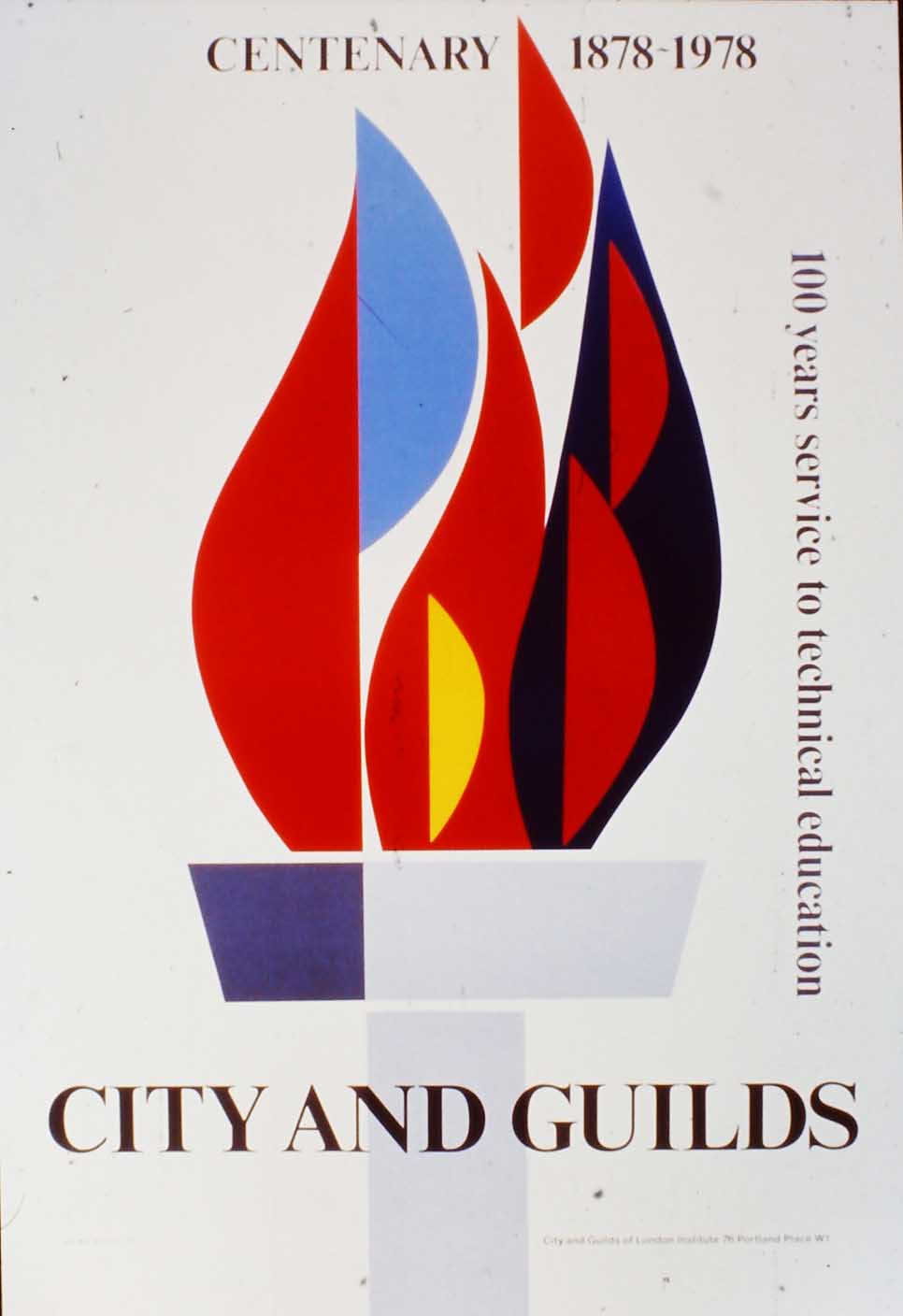
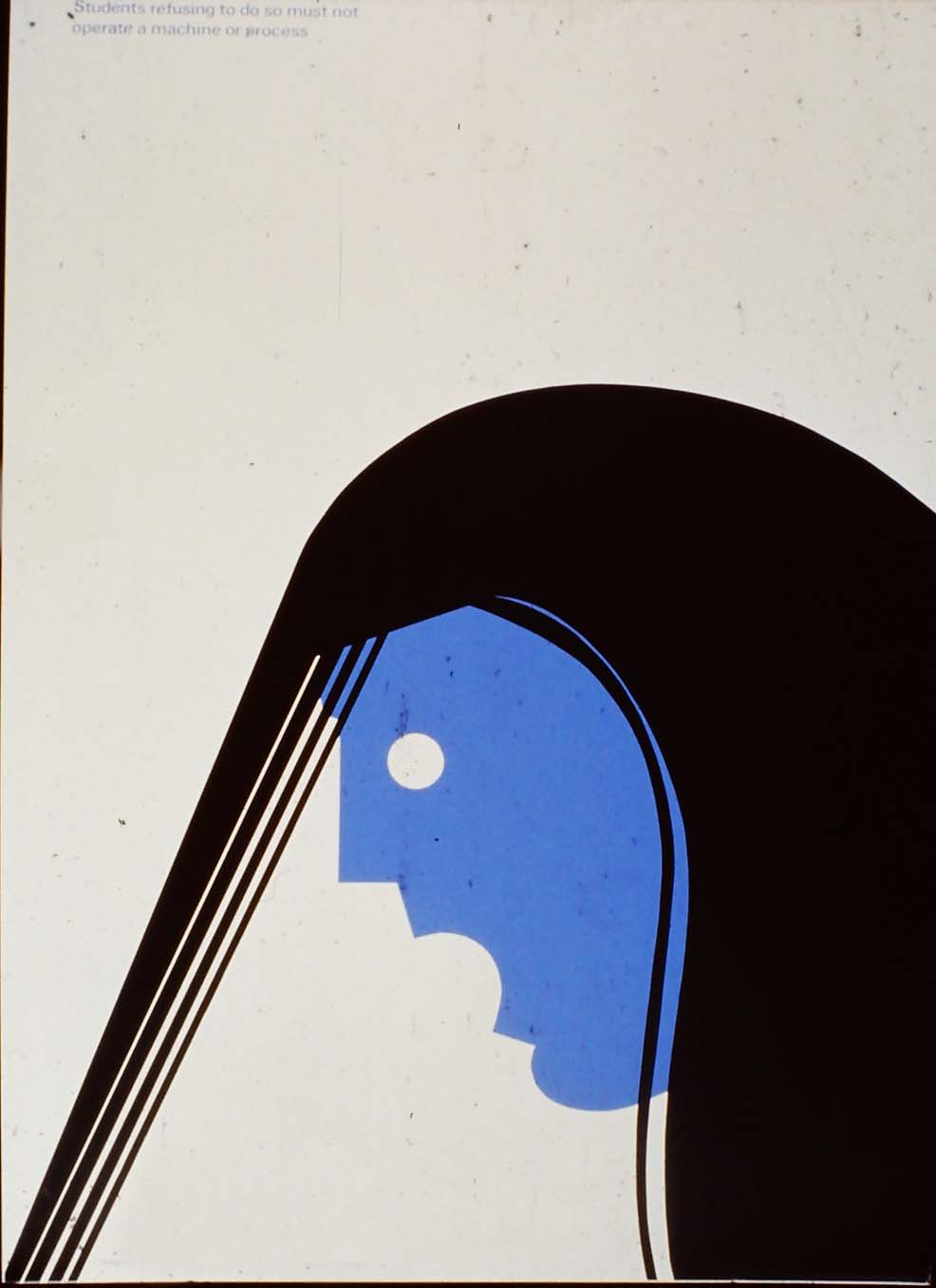
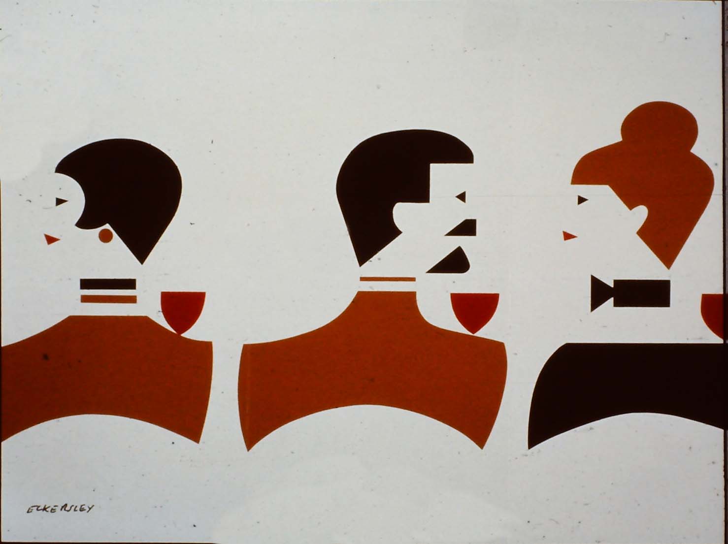
The examples I have chosen above are to reflect aspects of what I have written and are not a chronological survey. Go to the LCC site for accurate sizes and dates.
|