![]()
POSTER FOR LEPRA,
serendipity in design
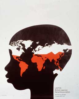
I think that this Leprosy poster is one of the better efforts I have achieved. It was an interesting problem. I had to put over this idea that to help LEPRA was to help leprosy. I remember going along to see see the client. He showed me photographs of the effects of Leprosy on faces. They had used photographs of faces with disfigurement on previous posters. I didn't want to use that approach. While I was talking to him I noticed a map on the wall which showed where the disease was situated in the world, and it was quite a surprise because I thought it was just India and Africa. It is found on all places on the world map. I felt that if it surprised me, it would make an impact with the public too. . Anyway I went away and thought it through.. I had to show a human being. It can be a man. It can be a woman. Best of all, I thought, it could be a child. I drew a child's head and I thought, this is satisfactory so far but how to show disfigurement? I had decided against doing it photographically. I tried it every way I could think of. A typographic solution with the word Leprosy printed over the face. I had been working on another idea not using the head, but using the World Map. I had actually cut a map out and it was on my desk. I don't know how it happened but it blew over the head and I said suddenly to myself, that's it, exactly what I want. A lot of these things happen, by chance, but you have got to be able to spot it when it happens. You may be walking down the street and turn a corner and see the answer to a problem.Once I went to the cinema and in the middle of a newsreel something would come up relating to what you are doing. Serendipity. I used to design a Christmas card every year, like most designers do. I used to get back a terrific display of cards every year - Savignac, Nathan those sort of people. One year when I was stuck and I turned the TV on during the Weather forecast. There as my answer to the card, the map of the British Isles as Santa Claus - with Cornwall as the boot, and Scotland as the head. It was a British Christmas Card and I got the idea purely by chance. It's not all sitting down and hammering it all out. The typography I used? I used a condensed type because there was quite a number of words. All the elements within the poster are from cut paper, a technique I started using at the beginning of the 1960's.It wasn't exactly a new technique. The Beggarstaff Brothers used it around 1900 and after. Before the 1960's the choice of coloured paper was inadequate - one terrible red I remember and a blue. Now there is a huge choice. It allows for considerable adjustment. The client told me in advance where the poster was to be shown, international and national venues. In this case it was a 16 sheet poster and a 4 and a 1 sheet. And it was also used on their letterhead. It does actually reduce very well. It could be used as a postage stamp too. The poster was very successful and won a Poster Design Award that year (1975 for the British Leprosy Relief Appeal) |
![]()